6  Statistics

This section is not intended as a textbook on statistics. Rather it demonstrates regression approaches including sample size estimation and power calculation. Metaanalysis is described in another chapter.

6.1 Frequentist versus Bayesian methods

This section focusses on frequentist approaches (parameter of the population is not a random variable). Bayesian regression methods are described in a separate chapter. Bayesian approaches assume that the parameter is randomly distributed. Frequentist approaches provide confidence interval and p-values whereas Bayesian methods provide credible interval and posterior distribution. When we are evaluating the null hypthesis, we are using frequentist method. Bayesian methods provide results in terms of probability.

6.2 Gaussian Distribution

The Gausian (normal) distribution is often described to have a symmetric bell shape centred around the mean \(\mu\). The standard deviation \(\sigma\) describes the spread of the data. In this case 95% of the data is contained within 2 standard deviation of the mean. It’s been proposed that as the sample size is larger than 30 the distribution approximate the normal distribution. Statistical tests describe below use the Gaussian distribution for example linear regression etc. The Student’s t-distribution resemble the normal distribution but has heavier tails.

6.3 Binomial distribution

The Binomial distribution describes a sequence of n events of binary (yes or no) type and the probability of their occurrence. The probability of an event occurring is p and not occurring is 1-p. A variety of different methods for calculating the 95% confidence interval of the binomial distribution. The mean of the binomial distribution is given by p and the variance by \(\frac{p×(1−p)}{n}\). The term z is given by 1−α2 quantile of normal distribution. A standard way of calculating the confidence interval is the Wald method \(p±z× \frac{p×(1−p)}{n}\).

6.3.0.1 Freeman-Tukey

The Freeman-Tukey double arcsine transformation tries to transform the proportion to a normal distribution. This approach is useful for handling when the occurrence of event is rare. The exact or Clopper-Pearson method is suggested as the most conservative of the methods for calculating confidence interval for proportion. It is based on cumulative properties of the binomial distribution.

6.3.0.2 Wilson Method

The Wilson method has similarities to the Wald method. It has an extra term \(z*\frac{2}{n}\). There are many different methods for calculating the confidence interval for proportions. Investigators such as Agresti proposed that approximate methods are better than exact method. This project is also under development.

6.4 Poisson Distribution

The Poisson Distribution describes the probability of a number of events occurring over a fixed period such as radioactive decay. The mean and variance are the same.

6.4.1 Negative binomial distribution

The mean is given by \(\frac{r*(1-p)}{p}\) and the variance is \(\frac{r*(1-p)}{p^2}\) The negative binomial distribution is used when the mean and variance are different.

6.5 Univariable analyses

6.5.1 Parametric tests

6.5.1.1 t-test

T-test is the workhorse for comparing if 2 dataset have the same distribution. Performing t-test in R requires data in one long column and another column containing the grouping variable. There are different forms of t-test depending on whether the two samples are paired or unpaired. In general, the analysis takes the form of \(t=\frac{\mu_1 - \mu_2}{variance}\). It is recommended to check the distribution of the data by using histogram. For this exercise, we will use the simulated data from ECR trials. The grouping variable is the trial assignment.

#comparison of early neurological recovery (ENI) by trial (T)

dtTrial<-read.csv("./Data-Use/dtTrial_simulated.csv")

#perform
t.test(dtTrial$ENI~dtTrial$T)

    Welch Two Sample t-test

data:  dtTrial$ENI by dtTrial$T
t = 0.17454, df = 487.36, p-value = 0.8615
alternative hypothesis: true difference in means between group 0 and group 1 is not equal to 0
95 percent confidence interval:
 -0.04569535  0.05460540
sample estimates:
mean in group 0 mean in group 1 
      0.3084644       0.3040094 

6.5.1.2 ANOVA

We repeat the analysis using ANOVA. The name ANOVA implies analysis of variance. As such, the ANOVA test compares the ratio of the \(variance_{between}\) to \(variance_{within}\) . Unlike the t-test, it cannot provide information on direction of change.

aov(dtTrial$ENI~dtTrial$T)
Call:
   aov(formula = dtTrial$ENI ~ dtTrial$T)

Terms:
                dtTrial$T Residuals
Sum of Squares    0.00248  40.33615
Deg. of Freedom         1       498

Residual standard error: 0.2845985
Estimated effects may be unbalanced

Checking if normality exists by examining the histogram of the residuals.

hist(aov(dtTrial$ENI~dtTrial$T)$residuals)

Checking if normality exists by examining the qqplot of the residuals.

car::qqPlot(aov(dtTrial$ENI~dtTrial$T)$residuals)

[1] 255 489

Formally test for normality of residual. The p value should be >0.05.

shapiro.test(aov(dtTrial$ENI~dtTrial$T)$residuals)

    Shapiro-Wilk normality test

data:  aov(dtTrial$ENI ~ dtTrial$T)$residuals
W = 0.99756, p-value = 0.6839

For 3 or more groups analysis, the data should be in long format.

6.5.2 Non-parametric tests

Chi-squared and Fisher-exact tests can be done by using the table function for setting up the count data into 2 x 2 contingency table or confusion matrix. The formula for the Chi-squared test takes on a familiar form \(\chi^2=\frac{(observed-expected)^2}{expected}\). In this example we will use the data above.

table(dtTrial$HT,dtTrial$T)
   
      0   1
  0 112 101
  1 144 143
chisq.test(dtTrial$HT,dtTrial$T)

    Pearson's Chi-squared test with Yates' continuity correction

data:  dtTrial$HT and dtTrial$T
X-squared = 0.19553, df = 1, p-value = 0.6584

The Wilcoxon rank sum test is performed with continuous data organised in the same way as the t-test. There are several different approaches to performing Wilcoxon rank sum test. The coin package allows handling of ties.

library(coin)
Loading required package: survival
wilcox.test(ENI~T, data=dtTrial)

    Wilcoxon rank sum test with continuity correction

data:  ENI by T
W = 31159, p-value = 0.9642
alternative hypothesis: true location shift is not equal to 0

6.6 Regression

There are many different form of regression methods. A key principle is that the predictors are independent of each others. A matrix interpretation of regression is provided in appendix That section contains an explanation why collinearity leads to unstable regression results. The methods described in this section are multivariable analyses. Multivariate regression is discussed in a separate section on longitudinal data analysis and penalised regression.

6.6.1 Linear (least square) regression

Least square regression uses the geometric properties of Euclidean geometry to identify the line of best. The sum of squares \(SSE\) is \(\sum(observed-expected)^2\). The \(R^2\) is a measure of the fit of the model. It is given by \(1-\frac{SS_(res)}{SS_(total)}\). Low \(R^2\) indicates a poorly fitted model and high \(R^2\) indicates excellent fitting. The assumption here is that the outcome variable is a continuous variable.

We illustrate the case with the world_stroke data from Global Burden of Disease 2016. The p-value here suggests a positive relationship.

load("./Data-Use/world_stroke.Rda")

Fit<-lm(MeanLifetimeRisk~LifeExpectancy, data=world_sfdf)

summary(Fit)

Call:
lm(formula = MeanLifetimeRisk ~ LifeExpectancy, data = world_sfdf)

Residuals:
    Min      1Q  Median      3Q     Max 
-7.9106 -3.4677 -0.9678  1.6877 17.2751 

Coefficients:
                Estimate Std. Error t value Pr(>|t|)    
(Intercept)    -14.76342    3.39053  -4.354 2.28e-05 ***
LifeExpectancy   0.48215    0.04681  10.301  < 2e-16 ***
---
Signif. codes:  0 '***' 0.001 '**' 0.01 '*' 0.05 '.' 0.1 ' ' 1

Residual standard error: 4.866 on 173 degrees of freedom
  (71 observations deleted due to missingness)
Multiple R-squared:  0.3802,    Adjusted R-squared:  0.3766 
F-statistic: 106.1 on 1 and 173 DF,  p-value: < 2.2e-16

Plotting the data suggests that another type of regression model should be used.

library(ggplot2)

ggplot(world_sfdf, aes(x=LifeExpectancy,y=MeanLifetimeRisk))+
  geom_smooth(method="lm", aes(Group=Income, 
    linetype=Income))+geom_point()+xlab("Life Expectancy")
`geom_smooth()` using formula = 'y ~ x'

6.6.1.1 Weighted least squares

Weighted least squares differentially weight the each covariate by their variance.

We use the world stroke data above but remove data from high income countries as illustration.

library (sf)
load("./Data-Use/world_stroke.Rda")
world_sfdf2<-world_sfdf %>% 
  #remove geometry to convert to simple data frame
  st_drop_geometry() %>%
  #remove High income countries
  filter (Income !="High")

#Perform linear regression
Fit2<-lm(MeanLifetimeRisk~LifeExpectancy, data=world_sfdf2)

#define weights to use
wt <- 1 / lm(abs(Fit2$residuals) ~ Fit2$fitted.values)$fitted.values^2

#perform weighted least squares regression
wls_model <- lm(MeanLifetimeRisk~LifeExpectancy, 
                data = world_sfdf2, weights=wt)

6.6.1.2 Robust regression

Least squares regression can be sensitive to outliers. Outliers can be seen when plotting the data. Robust regression should be considered when there is heterosedascity in the data where the variance is unstable. This cab be seen as a form of weighted regression. In this method the Huber loss function is applied

6.6.2 Logistic regression

For outcome that are binary in nature such as yes or no, then the least square regression is not appropriate. There are no close form solution for this analysis and a numerical approach using maximum likelihood estimation is needed. Logistic regression falls under the generalised linear model. When examining the results of logistic regression one is often enchanted by the large odds ratio. It is important to look at the metrics of model calibration (discussed below). A clue to a poorly calibrated model is the observation that the width of the confidence interval for odds ratio is wide.

data("titanic", package = "mlr3data")
dplyr::glimpse(titanic)
Rows: 1,309
Columns: 11
$ survived <fct> no, yes, yes, yes, no, no, no, no, yes, yes, yes, yes, no, no…
$ pclass   <ord> 3, 1, 3, 1, 3, 3, 1, 3, 3, 2, 3, 1, 3, 3, 3, 2, 3, 2, 3, 3, 2…
$ name     <chr> "Braund, Mr. Owen Harris", "Cumings, Mrs. John Bradley (Flore…
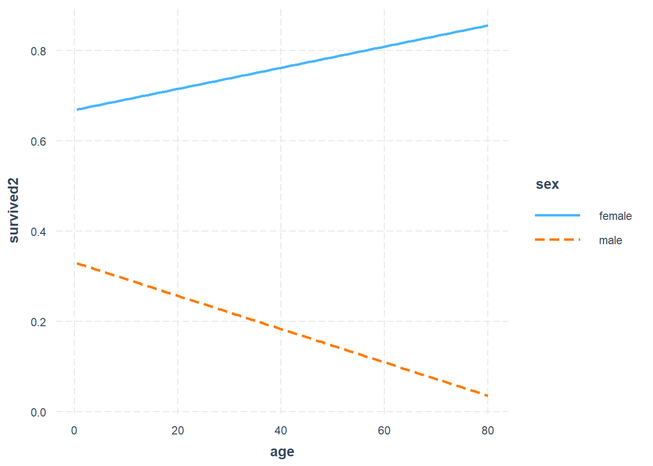
$ sex      <fct> male, female, female, female, male, male, male, male, female,…
$ age      <dbl> 22, 38, 26, 35, 35, NA, 54, 2, 27, 14, 4, 58, 20, 39, 14, 55,…
$ sib_sp   <int> 1, 1, 0, 1, 0, 0, 0, 3, 0, 1, 1, 0, 0, 1, 0, 0, 4, 0, 1, 0, 0…
$ parch    <int> 0, 0, 0, 0, 0, 0, 0, 1, 2, 0, 1, 0, 0, 5, 0, 0, 1, 0, 0, 0, 0…
$ ticket   <chr> "A/5 21171", "PC 17599", "STON/O2. 3101282", "113803", "37345…
$ fare     <dbl> 7.2500, 71.2833, 7.9250, 53.1000, 8.0500, 8.4583, 51.8625, 21…
$ cabin    <chr> NA, "C85", NA, "C123", NA, NA, "E46", NA, NA, NA, "G6", "C103…
$ embarked <fct> S, C, S, S, S, Q, S, S, S, C, S, S, S, S, S, S, Q, S, S, C, S…
#convert factor to binary
A<-as.character(titanic$survived)
titanic$survived2<-A
titanic$survived2[titanic$survived2=="no"]<-0
titanic$survived2[titanic$survived2=="yes"]<-1
titanic$survived2<-as.numeric(titanic$survived2)

Fit_titanic<-glm(survived2~sex+fare+embarked+age, data=titanic)
summary(Fit_titanic)

Call:
glm(formula = survived2 ~ sex + fare + embarked + age, data = titanic)

Coefficients:
              Estimate Std. Error t value Pr(>|t|)    
(Intercept)  0.8362686  0.0537098  15.570  < 2e-16 ***
sexmale     -0.5057100  0.0322406 -15.686  < 2e-16 ***
fare         0.0013764  0.0003053   4.509 7.64e-06 ***
embarkedQ   -0.2373424  0.0853334  -2.781  0.00556 ** 
embarkedS   -0.1235889  0.0412141  -2.999  0.00281 ** 
age         -0.0017578  0.0010553  -1.666  0.09622 .  
---
Signif. codes:  0 '***' 0.001 '**' 0.01 '*' 0.05 '.' 0.1 ' ' 1

(Dispersion parameter for gaussian family taken to be 0.1625)

    Null deviance: 171.51  on 711  degrees of freedom
Residual deviance: 114.72  on 706  degrees of freedom
  (597 observations deleted due to missingness)
AIC: 734.78

Number of Fisher Scoring iterations: 2

6.6.2.1 Odds ratio

The Odds ratio compares the odds between 2 group. Below, the Odds can be seen as the probability of an event occurring divided by the event not occurring.

\(Odds_{treatment}=\frac{p}{1-p}\)

\(Odds_{control}=\frac{p}{1-p}\)

\(Odds Ratio=\frac{Odds_{treatment}}{Odss_{control}}\)

The odds ratio 1.5 can be interpreted as 50% greater odds and 0.5 as 50% lesser odds of an outcome than the alternate outcome.

6.6.2.2 Risk ratio

The Risk refers to the probability of an event against all possible outcome. The risk and odds become similar when the event rate is very low. Risk ratio is appropriate when analysing prospective case control study.

6.6.3 Calibration

A high \(R^2\) suggests that the linear regression model is well calibrated. This metric is often not displayed but should be sought when interpreting the data. There are several ways to measure calibration for logistic regression such as pseudo \(R^2\) and Brier score.

Calibration of logistic regression model is performed using the Hosmer–Lemeshow goodness-of-fit test and the Nagelkerke generalized \(R^2\). A model is well calibrated when the Hosmer–Lemeshow goodness-of-fit test shows no difference between observed and expected outcome or P value approaching 1. A high generalized \(R^2\) value suggests a well-calibrated regression model. Brier score is a cost function that measures the mean square difference between the predicted probability and the observed binary outcome. A well-calibrated model has low Brier score and a high generalized R2 value. Running regression through the rms or PredictABEL library provide these results. The generalized \(R^2\) can be obtained manually from base R by running an intercept only model and again with covariates. It is given by \(1-\frac{L1}{L0}\).

The rms library provides calculation of calibration of the model including Brier score.

data("BreastCancer",package = "mlbench")
#remove id column and column with NA to feed into iml later
BreastCancer2<-lapply(BreastCancer[,-c(1,7)], as.numeric)
BreastCancer2<-as.data.frame(BreastCancer2)
DCa<-glm(Class~., data=BreastCancer2)
summary(DCa)

Call:
glm(formula = Class ~ ., data = BreastCancer2)

Coefficients:
                Estimate Std. Error t value Pr(>|t|)    
(Intercept)     0.723054   0.018613  38.847  < 2e-16 ***
Cl.thickness    0.042754   0.003992  10.709  < 2e-16 ***
Cell.size       0.019263   0.007293   2.641  0.00845 ** 
Cell.shape      0.032217   0.007016   4.592 5.22e-06 ***
Marg.adhesion   0.021463   0.004386   4.893 1.24e-06 ***
Epith.c.size    0.011637   0.005965   1.951  0.05148 .  
Bl.cromatin     0.035266   0.005650   6.241 7.57e-10 ***
Normal.nucleoli 0.016928   0.004247   3.986 7.44e-05 ***
Mitoses         0.001086   0.006048   0.180  0.85757    
---
Signif. codes:  0 '***' 0.001 '**' 0.01 '*' 0.05 '.' 0.1 ' ' 1

(Dispersion parameter for gaussian family taken to be 0.0481263)

    Null deviance: 157.908  on 698  degrees of freedom
Residual deviance:  33.207  on 690  degrees of freedom
AIC: -126.1

Number of Fisher Scoring iterations: 2
#lrm on logistic regression analysis for Breast Cancer
library(rms)
Loading required package: Hmisc

Attaching package: 'Hmisc'
The following objects are masked from 'package:base':

    format.pval, units
DCa_rms<-lrm(Class~., data=BreastCancer2)
DCa_rms
Logistic Regression Model

lrm(formula = Class ~ ., data = BreastCancer2)

                       Model Likelihood      Discrimination    Rank Discrim.    
                             Ratio Test             Indexes          Indexes    
Obs           699    LR chi2     759.86      R2       0.915    C       0.993    
 1            458    d.f.             8      R2(8,699)0.659    Dxy     0.986    
 2            241    Pr(> chi2) <0.0001    R2(8,473.7)0.795    gamma   0.986    
max |deriv| 8e-10                            Brier    0.028    tau-a   0.446    

                Coef    S.E.   Wald Z Pr(>|Z|)
Intercept       -9.9477 1.0317 -9.64  <0.0001 
Cl.thickness     0.5776 0.1190  4.85  <0.0001 
Cell.size       -0.0115 0.1759 -0.07  0.9479  
Cell.shape       0.5679 0.1913  2.97  0.0030  
Marg.adhesion    0.3137 0.1004  3.13  0.0018  
Epith.c.size     0.1306 0.1406  0.93  0.3529  
Bl.cromatin      0.5800 0.1456  3.98  <0.0001 
Normal.nucleoli  0.1232 0.0987  1.25  0.2120  
Mitoses          0.6092 0.3226  1.89  0.0590  

6.6.4 Discrimination

The areas under the receiver operating characteristic curve (AUC) is used to assess how well the models discriminate between those who have the disease and those who do not have the disease of interest.

6.6.4.1 Area under the receiver operating characteristic curve (AUC)

An AUC of 0.5 is classified as no better than by chance; 0.8 to 0.89 provides good (excellent) discrimination, and 0.9 to 1.0 provides outstanding discrimination. This rule of thumb about interpreting AUC when reading the literature is language the authors used to describe the AUC. This test of discrimination is not synonymous with calibration. It is possible to have a model with high discrimination but poor calibration (Diamond 1992). The AUC is similar to Harrell’s c-index but the interpretation of difference in AUC and c-index between models is not straightforward. A difference in 0.1 of AUC correspond to the number of subject rank correctly.

6.6.4.2 C-index

The c-index was originally described for survival analysis (Harrell FE Jr 1982). Harrell described the c-index (concordance index) as estimating the probability that, of two randomly chosen patients, the patient with the higher prognostic score will outlive the patient with the lower prognostic score. As such the c-index should be interpreted as the number of concordant pairs relative to the total number of comparable pairs. It has been proposed that the AUC and c-index are not appropriate for survival analysis as they do not account for the dynamic nature of the data(Longato, Vettoretti, and Di Camillo 2020). The integrated Graf score has been proposed to account for difference in the estimated event-free survival probabilities with the actual outcome (Graf E 1999).

6.6.5 Calibration

6.6.5.1 Hosmer–Lemeshow goodness-of-fit test

Calibration of logistic regression model is performed using the Hosmer–Lemeshow goodness-of-fit test and the Nagelkerke generalized R2. A model is well calibrated when the Hosmer–Lemeshow goodness-of-fit test shows no difference between observed and expected outcome or P value approaching 1.

6.6.5.2 Generalised \(R^2\)

A high generalized \(R^2\) value suggests a well-calibrated regression model. Running regression through the rms or PredictABEL libraries provide these results. The generalized \(R^2\) can be obtained manually from base R by running an intercept only model and again with covariates. It is given by \(1-\frac{L1}{L0}\).

6.6.5.3 Measuring Improvement in Regression Models

The net reclassification improvement (NRI) and integrated discrimination improvement (IDI) have been proposed as more sensitive metrics of improvement in model discrimination.The NRI can be considered as a percentage reclassification for the risk categories and the IDI is the mean difference in predicted probabilities between 2 models (constructed from cases with disease and without disease). The NRI and IDI scores are expressed as fractions and can be converted to percentage by multiplying 100.The continuous NRI and IDI can be performed using PredictABEL [Phan et al. (2017)](Phan et al. 2016).

6.6.6 Shapley value

We can use ideas from game theory relating to fair distribution of profit in coalition games; the coalition (co-operative) game in this case can be interpreted as contribution of the covariates to the model. The Shapley value regression method calculates the marginal contribution of each covariate as the average of all permutations of the coalition of the covariates containing the covariate of interest minus the coalition without the covariate of interest. The advantage of this approach is that it can handle multicollinearity (relatedness) among the covariates.

The feature importance is used to assess the impact of the features on the model’s decision

#this section takes the output from logistic regression above.
library(iml)
X = BreastCancer2[which(names(BreastCancer2) != "Class")]
predictor = Predictor$new(DCa, data = X, y = BreastCancer2$Class)
imp = FeatureImp$new(predictor, loss = "mae")
plot(imp)

From the logistic regression above cell thickness and cromatin have the highest coefficient and lowest p value. This is the same as feature importance. By contrast the Shapley values show that cell shape and marg adhesion make the largest impact on the model when considering the contribution to the model after considering all the contribution by different coalitions.

#explain with game theory
shapley <- Shapley$new(predictor, x.interest = X[1, ])
shapley$plot()

6.6.6.1 ICE plot

The individual conditional expectation (ICE) curves plots the expectation of the predictive value for each observation at the unique value for the feature.

#feature is the covariate of interest
par(mfrow=c(1,2))
eff_thick <- FeatureEffect$new(predictor, 
                         feature = "Cl.thickness", 
                         method = "ice",
                         center.at = 0)

plot(eff_thick)

6.6.7 Interaction

6.6.7.1 Interaction with interpretable machine learning

Interactions is plotted here using lollipop bar. The ggalt library can be used to create this type of plot with geom_lollipop. The strength of interaction is measured using Friedman’s H-statistics. The H-statistics ranges from 0 to 1 with 1 indicating the overall interaction strength. In the case with Breast Cancer data, the interaction strength is low.

#plot interactions
interact <- Interaction$new(predictor)

plot(interact)

6.6.7.2 Interaction with logistic regression

When describing interaction terms it is recommended that the results be expressed as β coefficients rather than as odds ratio. For example, the coefficient for age and sex can be interpreted but not the interaction term between age and sex.

#titanic

library(rms)

Fit_titanic.interact<-lrm(survived2~age*sex+fare, data=titanic)

Fit_titanic.interact
Frequencies of Missing Values Due to Each Variable
survived2       age       sex      fare 
      418       263         0         1 

Logistic Regression Model

lrm(formula = survived2 ~ age * sex + fare, data = titanic)

                       Model Likelihood      Discrimination    Rank Discrim.    
                             Ratio Test             Indexes          Indexes    
Obs           714    LR chi2     256.18      R2       0.407    C       0.821    
 0            424    d.f.             4      R2(4,714)0.298    Dxy     0.642    
 1            290    Pr(> chi2) <0.0001    R2(4,516.6)0.386    gamma   0.642    
max |deriv| 8e-07                            Brier    0.162    tau-a   0.310    

               Coef    S.E.   Wald Z Pr(>|Z|)
Intercept       0.3156 0.3194  0.99  0.3230  
age             0.0127 0.0108  1.18  0.2392  
sex=male       -1.3063 0.4137 -3.16  0.0016  
fare            0.0125 0.0027  4.61  <0.0001 
age * sex=male -0.0376 0.0137 -2.74  0.0061  

Plotting of interaction using interactions library. The divergent lines suggest interaction between the two terms and is in line with the interaction analysis in the regression model above. The interact_plot uses ggplot2 syntax.

#aSAH data

library(interactions)

Fit_titanic.interact<-glm(survived2~age*sex+fare, data=titanic)

interact_plot(Fit_titanic.interact, pred=age, modx=sex)

6.6.7.3 Interaction with decision tree

Decision tree is used here to illustrate interaction between age and sex. More on decision tree is available in the machine learning chapter.

library(rpart)
library(rpart.plot)

#survived =0

Tree_titanic<-rpart(survived2~age+sex+fare, data=titanic, 
                    method = "class")

rpart.plot(Tree_titanic)

6.7 Simpson’s paradox

Simpson’s paradox occurs when significant findings are found in smaller group analyses but these findings disappear when the groups are combined. Potential explanation include presence of confounders. The UC Berkeley gender bias is often cited as an example of Simpson’s paradox.

6.8 Confounder

A confounder is a covariate that serves as a cause of both exposure and outcome and as such confound the analysis. A mediator exist on the causal pathway from exposure to outcome. A common misconception is that the multiple regression adjust for imbalance in covariates in clinical trial. This issue was observed in the pivotal NINDS alteplase trial. The results of the trial has since been accepted with re-analysis of this trial using covariate adjustment (Ingall et al. 2004).

There are several methods for covariate adjustment in randomised trials: direct adjustment, standardisation and inverse-probability-of-treatment weighting.

6.8.1 Confounder weighted model

The issue asked is whether one should choose to perform confounder analysis or propensity matching.

6.8.2 Propensity matching

Propensity matching is an important technique to adjust for imbalance in covariates between 2 arms. There are concerns with mis-use of this technique such as difference in placebo arms from multiple sclerosis trials (Signori et al. 2020). It is proposed that this technique should be used only if all the confounders are measurable. This situation may not be satisfied if the data were accrued at different period, in different continent etc.

6.8.3 E-values

The E-values (VanderWeele TJ 2017) has been proposed a measure of unmeasured confounders in observational studies. \(Evalue=RR+\sqrt(RR*(RR-1)\)

The E-value is a measure of the extent to which the confounder have on the treatment–outcome association, conditional on the measured covariates. A large E-value is desirable. The E-values is available in EValue library (Mathur MB 2018). Using the above formula and observation on the risk ratio of 10.73 of smoking on lung cancer

10.73+sqrt(10.73*(10.73-1))
[1] 20.94777

The E-value is calculated for risk ratio with the EValue library.

library(EValue)
Warning: package 'EValue' was built under R version 4.3.3
evalues.RR(est = 10.73, lo = 8.02, hi = 14.36)
            point    lower upper
RR       10.73000  8.02000 14.36
E-values 20.94777 15.52336    NA

Plotting the magnitude of the covariates needed to explain the point estimate.

bias_plot(10.73, xmax = 40)

The E-value for OR can be calculated using the evalues.OR argument.

#association between delay dysphagia screening and pneumonia
#OR 1.14, 1.03 to 1.24 

evalues.OR(1.14, 1.03, 1.24, rare = FALSE)
            point    lower    upper
RR       1.067708 1.014889 1.113553
E-values 1.336580 1.137815       NA

Plotting the magnitude of the covariates needed to explain the point estimate.

bias_plot(1.14, xmax = 5)

The E-value for HR can be calculated using the evalues.HR argument.

#HR of 1.8 (1.6 to 1.9, p<0.0001)
evalues.HR(1.8, 1.6, 1.9, rare=F)
            point    lower    upper
RR       1.500519 1.383970 1.557065
E-values 2.367143 2.112944       NA

Plotting the magnitude of the covariates needed to explain the point estimate.

bias_plot(1.80, xmax=8)

6.9 Causal inference

Causation and association are often misconstrued to be the same. However, the finding of correlation (association) does necessarily imply causation. Causal inference evaluates the response of an effect variable in the setting of change in the cause of the effect variable. There are issues with approach to analysis of causal inference. It can be performed using frequentist such as confounder weighted model or Bayesian methods such as Baysian additive regression tree. This is available under bartCause library.

6.10 Special types of regression

6.10.1 Ordinal regression

Ordinal regression is appropriate when the outcome variable is in the form of ordered categorical values. For example, the Rankin scale of disability is bounded between the values of 0 and 6. This type of analysis uses the proportional odds model and the requirement for this model is stringent. When examining results of ordinal regression check that the authors provide this metric, the Brant test. The Brant test assesses the parallel regression assumption. The Brant test is available in the Brant library. Ordinal regression is performed using polr function in MASS library.

6.10.2 Survival analysis

Survival analysis is useful when dealing with time to event data. Time to event data can be left, interval and right censoring. Left censoring exists when events may have already occurred at the start of the study eg purchase of phones. Right censoring exists when events have not happened yet eg cancer trial. Interval censoring exists when an insurance has been purchased but the date of product purchase is not yet known.

The Cox model assesses the hazard of outcome between two groups. The assumption of this model is that the hazard between each arm is proportional (Stensrud and Hernan 2020). The proportional hazard model can be tested based on the weighted Schoenfeld residuals(Grambsch and Therneau 1994). There are non-parametric models available when the assumption of the proportional hazard model does not hold.

In the next chapter on machine learning, an illustration of random survival forest with rfrsc libraryand ranger library are provided. In the section on [clinical trial][Interpreting clinical trials] we illustrate how the results can be converted to numbers needed to treat. The median survival corresponding to survival probability of 0.50 can be determined here. Metrics for assessing survival model was described above.

library(survival)
library(survminer)
Loading required package: ggpubr

Attaching package: 'survminer'
The following object is masked from 'package:survival':

    myeloma
#data from survival package on NCCTG lung cancer trial
#https://stat.ethz.ch/R-manual/R-devel/library/survival/html/lung.html
data(cancer, package="survival")

#time in is available in days
#status censored=1, dead=2
#sex:Male=1 Female=2

survfit(Surv(time, status) ~ 1, data = cancer)
Call: survfit(formula = Surv(time, status) ~ 1, data = cancer)

       n events median 0.95LCL 0.95UCL
[1,] 228    165    310     285     363
sfit<- coxph(Surv(time, status) ~ age+sex+ph.ecog+ph.karno+wt.loss, data = cancer)
summary(sfit)
Call:
coxph(formula = Surv(time, status) ~ age + sex + ph.ecog + ph.karno + 
    wt.loss, data = cancer)

  n= 213, number of events= 151 
   (15 observations deleted due to missingness)

              coef exp(coef)  se(coef)      z Pr(>|z|)    
age       0.015157  1.015273  0.009763  1.553 0.120538    
sex      -0.631422  0.531835  0.177134 -3.565 0.000364 ***
ph.ecog   0.740204  2.096364  0.191332  3.869 0.000109 ***
ph.karno  0.015251  1.015368  0.009797  1.557 0.119553    
wt.loss  -0.009298  0.990745  0.006699 -1.388 0.165168    
---
Signif. codes:  0 '***' 0.001 '**' 0.01 '*' 0.05 '.' 0.1 ' ' 1

         exp(coef) exp(-coef) lower .95 upper .95
age         1.0153     0.9850    0.9960    1.0349
sex         0.5318     1.8803    0.3758    0.7526
ph.ecog     2.0964     0.4770    1.4408    3.0502
ph.karno    1.0154     0.9849    0.9961    1.0351
wt.loss     0.9907     1.0093    0.9778    1.0038

Concordance= 0.64  (se = 0.026 )
Likelihood ratio test= 33.53  on 5 df,   p=3e-06
Wald test            = 32.27  on 5 df,   p=5e-06
Score (logrank) test = 32.83  on 5 df,   p=4e-06

Test proportional hazard assumption using weighted residuals (Grambsch and Therneau 1994). The finding below shows that inclusion of covariate ph.karno violate proportional hazard assumption.

cox.zph(sfit)
         chisq df     p
age      0.186  1 0.666
sex      2.059  1 0.151
ph.ecog  1.359  1 0.244
ph.karno 4.916  1 0.027
wt.loss  0.110  1 0.740
GLOBAL   7.174  5 0.208

Plot fit of survival model

ggcoxdiagnostics(sfit, type = "deviance", 
 ox.scale = "linear.predictions")
Warning: `gather_()` was deprecated in tidyr 1.2.0.
ℹ Please use `gather()` instead.
ℹ The deprecated feature was likely used in the survminer package.
  Please report the issue at <https://github.com/kassambara/survminer/issues>.
`geom_smooth()` using formula = 'y ~ x'

Forest plot of outcome from survival analysis

ggforest(sfit)

An alternative way to display the output from Cox regression is to use forestmodel library .

forestmodel::forest_model(sfit)

The \(pseudoR^2\) for Cox regression model proposed by Royston can be evaluated

royston(sfit)
        D     se(D)       R.D      R.KO       R.N      C.GH 
0.8546894 0.1495706 0.1484960 0.1515108 0.1459168 0.6418894 

6.10.2.1 Restricted mean survival time

The restricted mean survival time (RMST) is the area under the survival curve to a defined time point (Royston 2013). The survRM2 library

6.10.3 Quantile regression

Least spare regression is appropriate when the data has homoscedascity or the error term remains constant. This can be seen if the data varies around the fitted line. Homoscedascity implies that the data is homogenous. Quantile regression is appropriate when the distribution of the data is non-normal and it is more appropriate to look at the conditional median of the dependent variable. There are several libraries for this task quantreg and Bayesian libraries. In the example below, the life time risk of stroke is regressed against life expectancy using lest square and quantile regression. This data below is used as an example for performing quantile regression but does not imply that quantile regression is appropriate for this data.

library(quantreg)
library(ggplot2)

load("./Data-Use/world_stroke.Rda")

#quantile regression
rqfit <- rq( MeanLifetimeRisk~ LifeExpectancy, data = world_sfdf)
rqfit_sum<-summary(rqfit)

#least square regression
lsfit<-lm(MeanLifetimeRisk~LifeExpectancy,data=world_sfdf)
lsfit_sum<-summary(lsfit) 

#plot
ggplot(world_sfdf,  aes(x=LifeExpectancy,y=MeanLifetimeRisk))+
  #add fitted line for least square
  geom_abline(intercept =lsfit_sum$coefficients[1], slope=lsfit_sum$coefficients[2],color="red")+
  #add fitted line for quantile regression
  geom_point()+xlab("Life Expectancy")+
  geom_abline(intercept =rqfit_sum$coefficients[1], slope=rqfit_sum$coefficients[2],color="blue")

#annotate least square and quantile at position x, y
#annotate("text",x=60, y=27, label=paste0("least square =",                        round(lsfit_sum$coefficients[1],2) ,"+", round(lsfit_sum$coefficients[2],2),"x ","Life Expectancy"),color="red")+ annotate("text",x=75, y=12,label=paste0("quantile =",round(rqfit_sum$coefficients[1],2), " + ", round(rqfit_sum$coefficients[2],2)," x ","Life Expectancy"),color="blue")

6.10.4 Non-negative regression

In certain situations, it is necessary to constrain the analysis so that the regression coefficients are non-negative. For example, when regressing brain regions against infarct volume, there is no reason believe that a negative coefficient attributable to a brain region is possible(Phan, Donnan, Koga, et al. 2006) . Non-negative regression can be performed in R using nnls.

6.10.5 Poisson regression

Poisson regression is used when dealing with number of event over time or distance such as number of new admissions or new cases of hepatitis or TIA over time. An assumption of the Poisson distribution is that the mean & lambda; and variance λ are the same.

A special case of Poisson regression is the negative binomial regression. This latter method is used when the variance is greater than the mean pf the data or over-dispersed data. Negative binomial regression can be applied to number of ‘failure’ event over time. Here ‘failure’ has a lose definition and can be stroke recurrence after TIA or cirrhosis after hepatitis C infection.

Zero-inflated data occurs when there is an abundance of zeroes in the data (true and excess zeroes).

6.10.6 Conditional logistic regression

Conditional logistical regression model should be used when the aim is to compare pair of objects from the same patient. Examples include left and right arms or left and right carotid arteries or twin studies. This method is available from clogit in survival.

6.10.7 Multinomial modelling

Multinomial modelling is used when the outcome categorical variables are not ordered. This situation can occur when analysis involves choice outcome (choices of fruit: apple, orange or pear). In this case, the log odds of each of the categorical outcomes are analysed as a linear combination of the predictor variables. The nnet library have functions for performing this analysis.

6.10.8 Penalised regression

Penalized/Ridge regression is a method used to overcome collinearity in the columns of the predictor variables. Penalised regression involves introducing a bias factor into the correlation matrix to stabilise the errors in the estimate. There are several forms of penalisation.

6.10.8.1 L1 penalisation

This method of penalisation involves penalising the L norm \(||𝛽||\) of the coefficient or LASSO (least absolute shrinkage and selection operator). This is equivalent to an unconstrained minimization of the least-squares penalty.

6.10.8.2 L2 penalisation

The L2 norm \(||𝛽||_2^2\) refers to the quadratic penalization of the parameter estimate. The resultant estimates are smaller than those obtained from regression model. L2 penalisation is also known as ridge penalisation. The ridge estimator behaves like a curved estimator and as the penalty is increased, all parameters are reduced while still remaining non-zero. By contrast, the LASSO estimator behave in a more linear fashion in which increasing the penalty will result in more and more of the parameters to be driven to zero.

6.11 Sample size estimation

Clinicians are often frustrated about sample size and power estimation for a study, grant or clinical trial. This aspect is scrutinised by ethics committee and in peer review process for journals. Luckily, R provides several packages for sample size amd power estimation: pwr library. Cohen has written reference textbook on this subject (Cohen 1977).

6.11.1 Proportion

library(pwr)
#ttest-d is effect size 
#d = )mean group1 -mean group2)/variance
pwr.t.test(n=300,d=0.2,sig.level=.05,alternative="greater") 

     Two-sample t test power calculation 

              n = 300
              d = 0.2
      sig.level = 0.05
          power = 0.7886842
    alternative = greater

NOTE: n is number in *each* group

We provided an example below for generating power of clinical trial. Examples are taken from a paper on sample size estimation for phase II trials (Phan, Donnan, Davis, et al. 2006).

library(pwr)
#h is effect size. effect size of 0.5 is very large 
#sample size
pwr.2p.test(h=0.5,n=50,sig.level=0.05,alternative="two.sided")

     Difference of proportion power calculation for binomial distribution (arcsine transformation) 

              h = 0.5
              n = 50
      sig.level = 0.05
          power = 0.705418
    alternative = two.sided

NOTE: same sample sizes
#medium effect size
pwr.2p.test(h=0.1,n=50,sig.level=0.05,alternative="two.sided")

     Difference of proportion power calculation for binomial distribution (arcsine transformation) 

              h = 0.1
              n = 50
      sig.level = 0.05
          power = 0.07909753
    alternative = two.sided

NOTE: same sample sizes

The output of the sample size calculation can be put into a table or plot.

library(pwr)
#pwr.2p.test(h=0.3,n=80,sig.level=0.05,alternative="two.sided")
h <- seq(.1,.5,.1) #from 0.1 to 0.3 by 0.05
nh <- length(h) #5
p <- seq(.3,.9,.1)# power from 0.5 to 0.9 by 0.1
np <- length(p) #9
# create an empty array 9 x 5
samplesize <- array(numeric(nh*np), dim=c(nh,np))
for (i in 1:np){
  for (j in 1:nh){
    result <- pwr.2p.test(n = NULL, h = h[j],
    #result <- pwr.r.test(n = NULL, h = h[j],
    sig.level = .05, power = p[i],
    alternative = "two.sided")
    samplesize[j,i] <- ceiling(result$n)
  }
}
samplesize
     [,1] [,2] [,3] [,4] [,5] [,6] [,7]
[1,]  412  583  769  980 1235 1570 2102
[2,]  103  146  193  245  309  393  526
[3,]   46   65   86  109  138  175  234
[4,]   26   37   49   62   78   99  132
[5,]   17   24   31   40   50   63   85
#graph
xrange <- range(h)
yrange <- round(range(samplesize))
colors <- rainbow(length(p))
plot(xrange, yrange, type="n",
  xlab="Effect size (h)",
  ylab="Sample Size (n)" )
# add power curves
for (i in 1:np){
  lines(h, samplesize[,i], type="l", lwd=2, col=colors[i])
}
# add annotation (grid lines, title, legend) 
abline(v=0, h=seq(0,yrange[2],50), lty=2, col="grey89")
abline(h=0, v=seq(xrange[1],xrange[2],.02), lty=2,
   col="grey89")
title("Sample Size Estimation\n Difference in Proportion")
legend("topright", title="Power", as.character(p),
   fill=colors)

6.11.1.1 Non-inferiority

Non-inferiority trials may offer information in a way that a traditional superiority design do not. The design may be interested in other aspect of the treatment such as cost and lower toxicity (Kaji and Lewis 2015). Examples of non-inferiority trial designs include antibiotics versus surgery for appendicitis (Salminen et al. 2015). There are concerns with reporting of noninferiority trial. Justification for the margin provided in 27.6% (Gopal et al. 2015). The following describes a trial design where it’s expected that drug will result in a certain outcome p1 and the control arm p2 and the ratio of subject in treatment to control arm is k. The difference in outcome is delta. The margin is defined as non-inferior if <0.

library(TrialSize)
TwoSampleProportion.NIS(alpha=.05, 
                        beta=.8,
                        p1=.6,
                        p2=.7,
                        k=1,
                        delta = .1,       
                        margin=-.2
                        )
[1] 3.225911

6.11.2 Logistic regression

library(powerMediation)
library(ggplot2)

#continuous predictor
#p1=event rate
#exp(0.405) =1.5

powerLogisticCon(n=200, p1=0.265, OR=exp(0.014), alpha=0.05)
[1] 0.03056289
# creating a data frame using data from 
a=seq(0,05.4,0.05)
df_power<-data.frame(`ASPECTS`= a,
"Power"=powerLogisticCon(n=100, p1=a, OR=exp(.695), alpha=0.05)
)
Warning in sqrt(n * beta.star^2 * p1 * (1 - p1)): NaNs produced
ggplot(data=df_power, aes(x=ASPECTS, y=Power))+geom_point()
Warning: Removed 88 rows containing missing values or values outside the scale range
(`geom_point()`).

An alternative library to perform sample size for logistic regression is WebPower library.

library(WebPower) 
Loading required package: lme4

Attaching package: 'lme4'
The following object is masked from 'package:modeltools':

    refit
The following object is masked from 'package:nlme':

    lmList
The following object is masked from 'package:MatrixModels':

    mkRespMod
The following object is masked from 'package:generics':

    refit
Loading required package: lavaan
This is lavaan 0.6-15
lavaan is FREE software! Please report any bugs.
Loading required package: PearsonDS
wp.logistic(p0=0.007, #Prob (Y=1|X=0) 
            p1=0.012, #Prob (Y=1|X=1)
            alpha=0.05, 
            power=0.80, 
            alternative="two.sided", 
            family="normal")
Power for logistic regression

       p0    p1     beta0     beta1      n alpha power
    0.007 0.012 -4.954821 0.5440445 3336.2  0.05   0.8

URL: http://psychstat.org/logistic

6.11.3 Survival studies

Sample size for survival studies can be performed using powerSurvEpi or gsDesign.

library(powerSurvEpi)

#sample size
ssizeEpi.default(power = 0.80, 
                 theta = 2, 
                 p = 0.408 , 
                 psi = 0.15,
                 rho2 = 0.344^2, 
                 alpha = 0.05)
[1] 512
#power
powerEpi.default(n = 2691, 
                 theta = 2, 
                 p = 0.408, 
                 psi = 0.250,
                 rho2 = 0.344^2, 
                 alpha = 0.05)
[1] 1
#Amarenco NEJM 2020 #equal sample size k=1
ssizeCT.default(power = 0.8, k = .8, pE = 0.085, 
                pC = 0.109, 
                RR = 0.78, alpha = 0.05)
  nE   nC 
2417 3021 

6.11.4 Multiple regression

The power for general linear model can be calculated using the pwr.f2.test function.

library(pwr)
#u=degrees of freedom for numerator
#v=degrees of freedomfor denominator
#f2=effect size

6.12 Randomised clinical trials

A common misconception is that the multiple regression adjust for covariate imbalance in clinical trial. This issue was observed in the pivotal NINDS alteplase trial. The results of the trial has since been accepted with re-analysis of this trial using covariate adjustment(Ingall et al. 2004). There are several methods for covariate adjustment in radomised trials: direct adjustment, standardisation and inverse-probability-of-treatment weighting.

6.12.1 Covariate adjustment in trials

Specifically, covariate adjustment refers to adjustment of covariates available at the time of randomisation, i.e. prespecified variables and not variables after randomisation such as post-stroke pneumonia. The advantage of covariate adjustment is that it results in narrower confidence interval as well as increase the power of the trial up to 7% (Kahan 2014). The increased power is highest when prognostic variables are used but can decrease power when non-prognostic variables are used (Kahan 2014).

6.12.2 Subgroup analysis

Subgroup analysis can be misleading especially if not specified prior to trial analysis (Wang et al. 2007). Furthermore, increasing the number of subgroup analysis will lead to increasing the chance of false positive result or multiplicity. It is important to differentiate between pres-pecified and post-hoc analyses as post-hoc analyses may be biased by examination of the data.

6.12.3 p value for interaction

The p value for interaction describe the influence by a baseline variable treatment effect on outcome in clinical trial (Wang et al. 2007). In a hypothetical trial, a significant p value for interaction between males and females for treatment effect on primary outcome indicates heterogenity of treatment effect.

library(Publish)
Warning: package 'Publish' was built under R version 4.3.2
Loading required package: prodlim
Registered S3 methods overwritten by 'lava':
  method           from  
  print.estimate   EValue
  summary.estimate EValue
Registered S3 method overwritten by 'Publish':
  method   from
  print.ci coin
library(survival)

6.12.4 Interpreting risk reduction in clinical trials

A key issue in interpreting of clinical trials occurs when the relative risk reduction or relative hazard risk are provided. This issue affect the clinical interpretation of the trial finding and its application in practice. An example is the result of the ACAS asymptomatic carotid artery trial is often quoted as showing 50% risk reduction. In fact, there was 2% annual risk of ipsilateral stroke in the medical and 1% risk in the surgical arm. The absolute risk reduction or ARR was 1% per year. However, the 50% relative risk reduction is often quoted to explain to patients.

6.12.5 NNT from ARR

In this case, the number needed to treat (NNT) is given by \(\frac{1}{ARR}\) or \(\frac{1}{0.01}=100\) to achieve the trial outcome or 100 patients are needed to be treated to reduce the stroke risk to 1%. The recommendation is that the 95% confidence interval for NNT should be provided.

6.12.6 NNT from odds ratio

Calculation of NNT for odds ratio requires knowledge of the outcome of the placebo group. The NNT is given by \(\frac{1}{ACR-\frac{OR*ACR}{1-(ACR+OR*ACR)}}\). The ACR represents the assumed control risk. The NNT can be calculated from nnt function in meta library.

library(meta)
Warning: package 'meta' was built under R version 4.3.2
Loading required package: metadat
Loading 'meta' package (version 7.0-0).
Type 'help(meta)' for a brief overview.
Readers of 'Meta-Analysis with R (Use R!)' should install
older version of 'meta' package: https://tinyurl.com/dt4y5drs
#p.c = baseline risk
nnt(0.73, p.c = 0.3, sm = "OR")
    OR p.c      NNT
1 0.73 0.3 16.20811

6.12.7 NNT from risk ratio

#data from EXTEND-IV trial in NEJM 2019
#outcome 35.4% in tpa and 29.5% in control
nnt(1.44, p.c = 0.295, sm = "RR")
    RR   p.c      NNT
1 1.44 0.295 -7.70416

6.12.8 NNT from hazard ratio

Calculation of NNT for hazard ratio requires knowledge of the outcome of the placebo group and the hazard ratio or HR. The formula using the binomial theorem is \(p=1-q\) where q is given by the ratio of outcome and numbers recruited in the placebo group. The formula is taken from (Ludwig, Darmon, and Guerci 2020) . The NNT is given \(\frac{1}{[p^{HR}-p}\) . We illustrated this using data from metaanalysis on aspirin use in stroke in Lancet 2016. There were 45 events among 16053 patients in the control group. The HR was 0.44. The NNT from this formula \(\frac{1}{.9971968^.44-.9971968}\) was 637.

6.12.9 NNT from metaananlysis

There are concerns with using NNT from the results of metaanalysis as the findings are amalgations of trials with different settings (Marx 2003) (Smeeth 1999). The caution applies when baseline risks or absolute risk differences vary across trials.

6.13 Diagnostic test

6.13.1 Sensitivity, specificity

The sensitivity of a diagnostic test is the true positive rate and the specificity is the true negative rate. Example of 2 x 2 table is provided here. As an exercise, consider a paper about a diagnostic test for peripheral vertigo reporting 100% sensitivity and 94.4% specificity. There are 114 patients, 72 patients without stroke have vertigo and positive test findings. Among patients with stroke 7 of 42 have positive test findings. The sensitivity is \(TP=\frac{TP}{TP+FN}\) and the specificity is the \(TN=\frac{TN}{TN+FP}\).

#              Peripheral Vertigo
#            Disease Positive     Disease Negative
#$$$$$$$$$$$$$$$$$$$$$$$$$$$$$$$$$$$$$$$$$$$$$$$$$$$
# HIT Test#                 #                      $
# Positive# True Positive   # False Positive       $  
#         #     72          #       7              $
#$$$$$$$$$$$$$$$$$$$$$$$$$$$$$$$$$$$$$$$$$$$$$$$$$$$
# HIT Test#                 #                      $
# Negative# False Negative  # True Negative        $
#         #     0           #       35             $ 
#$$$$$$$$$$$$$$$$$$$$$$$$$$$$$$$$$$$$$$$$$$$$$$$$$$$

# Peripheral Vertigo
#Sensitiviy=TP/(TP+FN)=100%
#Specificity=TN/(TN+FP)=83%

6.13.2 AUC for diagnostic test

The area under the receiver operating characteristics (ROC) curve or AUC is a measure of the discrimination of the test. It is recommended that ROC curve is used when there are multiple thresholds. It should not be used when the test has only one threshold. Some investigators suggest caution regarding the validity of using receiver operating curve with single threshold diagnostic tests (J 2020). An AUC of 0.5 is classified as no better than by chance; 0.6–0.69 provides poor discrimination; 0.7–0.79 provides acceptable (fair) discrimination, 0.8 to 0.89 provides good (excellent) discrimination, and 0.9 to 1.0 provides outstanding discrimination.

6.13.3 Likelihood ratio

Positive likelihood ratio (PLR) is the ratio of sensitivity to false positive rate (FPR); the negative (NLR) likelihood ratio is the ratio of 1-sensitivity to specificity. A PLR indicates the likelihood that a positive spot sign (test) would be expected in a patient with ICH (target disorder) compared with the likelihood that the same result would be expected in a patient without ICH. Using the recommendation by Jaeschke et al, a high PLR (>5) and low NLR (<0.2) indicate that the test results would make moderate changes in the likelihood of hematoma growth from baseline risk. PLRs of >10 and NLRs of <0.1 would confer very large changes from baseline risk .

6.13.3.1 Fagan’s normogram

Fagan’s normogram can be conceptualised as a sliding ruler to match the disease prevalence and likelihood ratios to evaluate the impact on the post-test probability (TJ 1975). At the current disease prevalence of 23.4% and PLR 4.65, the post-test probability remains low at 0.60.

library(tidyverse)
── Attaching core tidyverse packages ──────────────────────── tidyverse 2.0.0 ──
✔ forcats   1.0.0     ✔ readr     2.1.4
✔ lubridate 1.9.2     ✔ tidyr     1.3.0
✔ purrr     1.0.1     
── Conflicts ────────────────────────────────────────── tidyverse_conflicts() ──
✖ purrr::%@%()           masks rlang::%@%()
✖ rlang:::=()            masks data.table:::=()
✖ dplyr::between()       masks data.table::between()
✖ readr::col_factor()    masks scales::col_factor()
✖ dplyr::collapse()      masks nlme::collapse()
✖ gridExtra::combine()   masks dplyr::combine()
✖ matrixStats::count()   masks dplyr::count()
✖ dplyr::data_frame()    masks tibble::data_frame(), vctrs::data_frame()
✖ dplyr::dim_desc()      masks pillar::dim_desc()
✖ purrr::discard()       masks scales::discard()
✖ tidyr::expand()        masks Matrix::expand()
✖ tidyr::extract()       masks magrittr::extract()
✖ dplyr::filter()        masks stats::filter()
✖ dplyr::first()         masks data.table::first()
✖ purrr::flatten()       masks jsonlite::flatten(), rlang::flatten()
✖ purrr::flatten_chr()   masks rlang::flatten_chr()
✖ purrr::flatten_dbl()   masks rlang::flatten_dbl()
✖ purrr::flatten_int()   masks rlang::flatten_int()
✖ purrr::flatten_lgl()   masks rlang::flatten_lgl()
✖ purrr::flatten_raw()   masks rlang::flatten_raw()
✖ lubridate::hour()      masks data.table::hour()
✖ purrr::invoke()        masks rlang::invoke()
✖ lubridate::isoweek()   masks data.table::isoweek()
✖ dplyr::lag()           masks stats::lag()
✖ dplyr::last()          masks data.table::last()
✖ rlang::ll()            masks Metrics::ll()
✖ rlang::local_options() masks withr::local_options()
✖ purrr::map()           masks listenv::map()
✖ lubridate::mday()      masks data.table::mday()
✖ lubridate::minute()    masks data.table::minute()
✖ lubridate::month()     masks data.table::month()
✖ tidyr::pack()          masks Matrix::pack()
✖ lubridate::quarter()   masks data.table::quarter()
✖ dplyr::recode()        masks car::recode()
✖ lubridate::second()    masks data.table::second()
✖ dplyr::select()        masks MASS::select()
✖ purrr::set_names()     masks rlang::set_names(), magrittr::set_names()
✖ purrr::some()          masks car::some()
✖ purrr::splice()        masks rlang::splice()
✖ dplyr::src()           masks Hmisc::src()
✖ cli::style_bold()      masks pillar::style_bold()
✖ dplyr::summarize()     masks Hmisc::summarize()
✖ purrr::transpose()     masks data.table::transpose()
✖ cli::tree()            masks xfun::tree()
✖ jsonlite::unbox()      masks rlang::unbox()
✖ tidyr::unpack()        masks Matrix::unpack()
✖ jsonlite::validate()   masks rms::validate()
✖ lubridate::wday()      masks data.table::wday()
✖ lubridate::week()      masks data.table::week()
✖ rlang::with_options()  masks withr::with_options()
✖ lubridate::yday()      masks data.table::yday()
✖ lubridate::year()      masks data.table::year()
ℹ Use the conflicted package (<http://conflicted.r-lib.org/>) to force all conflicts to become errors
source("https://raw.githubusercontent.com/achekroud/nomogrammer/master/nomogrammer.r")
p<-nomogrammer(Prevalence = .234, Plr = 4.85, Nlr = 0.49)
Warning: Using `size` aesthetic for lines was deprecated in ggplot2 3.4.0.
ℹ Please use `linewidth` instead.
Warning: The `trans` argument of `sec_axis()` is deprecated as of ggplot2 3.5.0.
ℹ Please use the `transform` argument instead.
p+ggtitle("Fagan's normogram for Spot Sign and ICH growth")

#to save the file
#ggsave(p,file="Fagan_SpotSign.png",width=5.99,height=3.99,units="in")

6.13.3.2 Likelihood ratio graph

Likelihood ratio graph is a tool for comparing diagnostic tests (BJ 2000). We wrote a function below to create likelihood ratio graph(Slater et al. 2024).

#plot likelihood ratio graph

LR_graph<-function (Read,sheet,Sensitivity, Specificity){
  
  Read1<-readxl::read_xlsx(Read, sheet = sheet)
  
  #binary data
  #A=True pos %B=False positive   %C=False negative   %D=True negative
  
  A=Read1$TP
  B=Read1$FP
  C=Read1$FN
  D=Read1$TN
  
  TPR=A/(A+C)
  FPR=1-(D/(D+B))
  
  TPR_DiagnosticTest=Sensitivity
  FPR_DiagnosticTest=1-Specificity
  
  # set plot
  
  X=seq(0,1,by=.1)
  Y=seq(0,1,by=.1)

  plot(X,Y,main="Likelihood Ratio graph", xlab="1-Specificity",ylab="Sensitivity",cex=.25)
  
  #pch describe the shape. The value 1 corresponds o
  points(FPR_DiagnosticTest,TPR_DiagnosticTest,pch=8,col="blue",cex=2)
  
  #pch describe the shape. The value 8 corresponds *
  points(FPR,TPR,pch=1,col="red",cex=2) #add point
  #abline(coef = c(0,1)) #add diagonal line
  df1<-data.frame(c1=c(0,TPR_DiagnosticTest),c2=c(0,FPR_DiagnosticTest))
  reg1<-lm(c1~c2,data=df1)
  df2<-data.frame(c1=c(TPR_DiagnosticTest,1),c2=c(FPR_DiagnosticTest,1))
  reg2<-lm(c1~c2,data=df2)
  abline(reg1)
  abline(reg2)
  text(x=FPR_DiagnosticTest,y=TPR_DiagnosticTest+.3,label="Superior",cex=.7)
  text(x=FPR_DiagnosticTest+.2,y=TPR_DiagnosticTest+.2,label="Absence",cex=.7)
  text(x=.0125,y=TPR_DiagnosticTest-.1,label="Presence",cex=.7)
  text(x=FPR_DiagnosticTest+.1,y=TPR_DiagnosticTest,label="Inferior",cex=.7)
  text(x=.7,y=.2,label="Reference = Content Expert",cex=.7)
  text(x=.7,y=.15, label="Diagnostic Test software", cex=.7)

}

Running the function from above

#Sensitivity=0.623
#Specificity=1-.927

LR_graph("./Data-Use/Diagnostic_test_summary.xlsx",1,.623,.927)
New names:
• `` -> `...11`