It is often said that the majority of time is spent on data cleaning and 20% on analysis. A common trap when one starts using R is that the library have not been installed or the data are in different folder to the working directory. Installing library is easy with the command install.packages. The command getwd() will tell you which directory you are in.
Sometimes, the user encounter issues with R. This is not an uncommon problem and often not due to serious errors but forgetting that R is case-sensitive. Also when copying codes from the net across, R does not recognise the “inverted comma” but has its own style of “inverted comma”. Unlike Python, R does not tolerate space between variables. R also does not like variables to be named starting with a number.
R treats the variables in certain ways depend on their class. Some function requires that the variables are numeric. The Breast Cancer data from mlbench has 11 columns with the 9 covariates being factors and ordered factors. These issues will be dealt further in the chapter on data wrangling. One way to get an overview of the structure of the data is to use the glimpse function from dplyr.
Another issue is that some libraries have assign certain names to their function and which is also used by other libraries. In the course of opening multiple libraries, R may be confused and use the last library open and which may lead to error result. We will illustrate this with the forest function in the Statistics chapter.
A selling point of R is that there is a large community of users who often post their solutions online. it’s worth spending time on stack overflow to look at similar problems that others have and the approaches to solving them. A clue to pose questions is to look at the error. If you wish to post questions for others to help then it’s encouraged that the question include some data so that the person providing the solution can understand the nature of the errors. Useful blogs are also available at https://www.r-bloggers.com/.
This chapter focuss on the ggplot2 and its related libraries for plotting (Wickham 2016). Base R also has plotting function but lacks the flexibility of ggplot2. Plotting is introduced early to enage clinicians who may not have the patience read the following chapter on data wrangling prior. The book is not intended to be used in a sequential fashion as the reader may find elements of this chapter relevant to them and jump to another chapter such as chapter 3 on statistics.
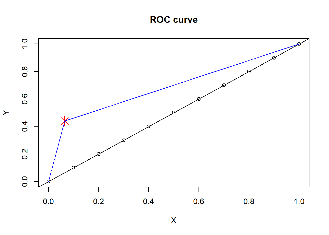
Line plot can be performed in base R using abline argument. The font is defined by cex argument and colour defined by col argument. The title is defined by main argument. The X and Y axes can be labelled using xlab and ylab arguments within the plot function. Below we illustrate example of drawing a line to a point and in the segment below we illustrate example of drawing a line.
#set parameters of plotX=seq(0,1,by=.1) #define a set of point from 0 to 1, separated by 0.1.Y=seq(0,1,by=.1)#define A and BA=.065; B=.44#location of pointplot(X,Y, main="ROC curve")points(A,B,pch=8,col="red",cex=2) #add pointabline(coef =c(0,1)) #add diagonal line#draw line to a pointsegments(x0=0,y0=0,x1=A,y1=B,col="blue")segments(x0=A,y0=B,x1=1,y=1,col="blue")
This is an illustration of using base R to plot regression line. Later, we will illustrate using geom_smooth call from ggplot2.
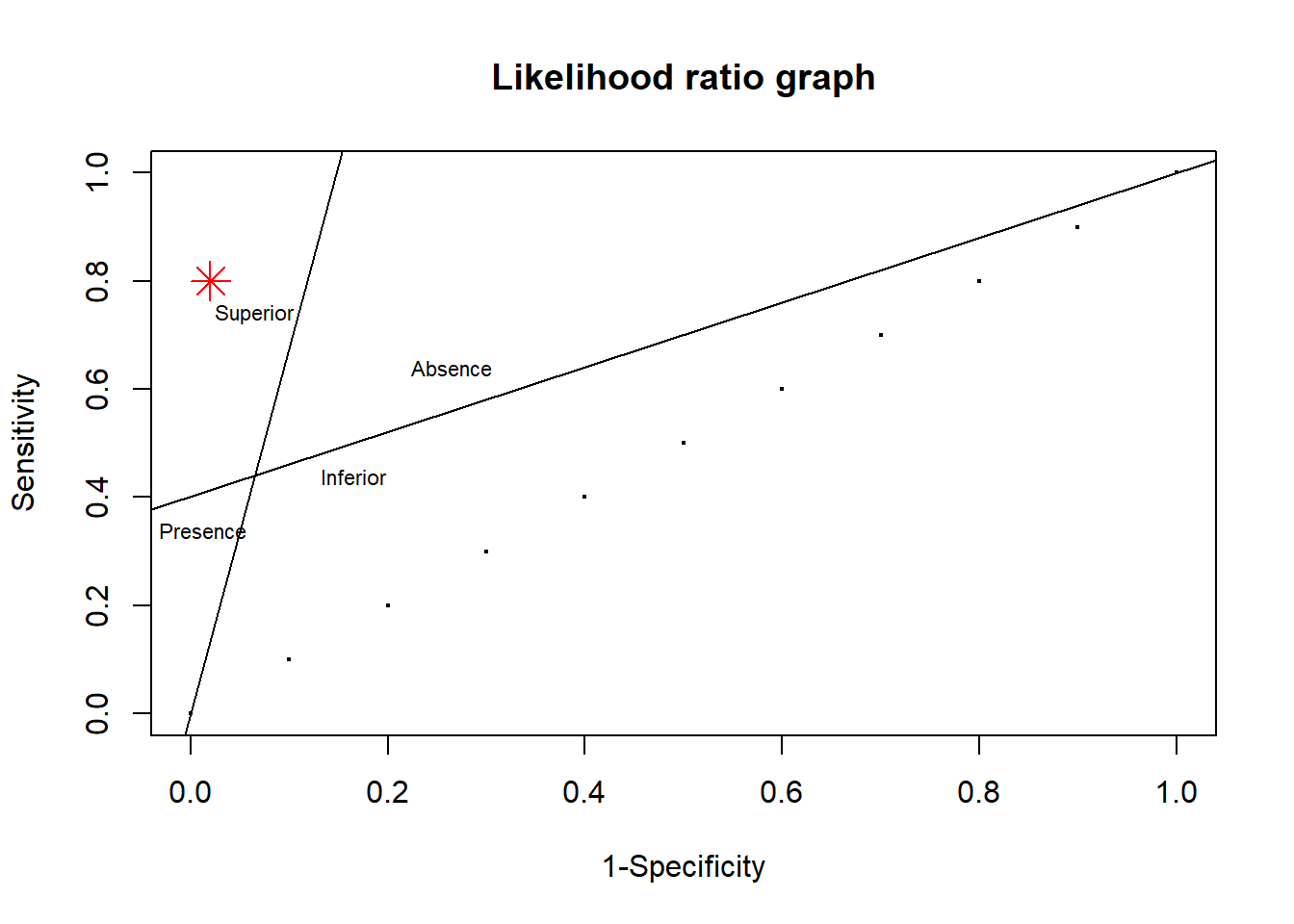
TPR_1=.44; FPR_1=.065plot(X,Y,main="Likelihood ratio graph", xlab="1-Specificity",ylab="Sensitivity",cex=.25)points(.02,.8,pch=8,col="red",cex=2) #add point df1<-data.frame(c1=c(0,TPR_1),c2=c(0,FPR_1)) reg1<-lm(c1~c2,data=df1) df2<-data.frame(c1=c(TPR_1,1),c2=c(FPR_1,1)) reg2<-lm(c1~c2,data=df2)abline(reg1) #draw line using coefficient reg1abline(reg2) #draw line using coefficient reg2text(x=FPR_1,y=TPR_1+.3,label="Superior",cex=.7)text(x=FPR_1+.2,y=TPR_1+.2,label="Absence",cex=.7)text(x=.0125,y=TPR_1-.1,label="Presence",cex=.7)text(x=FPR_1+.1,y=TPR_1,label="Inferior",cex=.7)
Function can be plotted using variations of the above. This requires a formula to describe variable Y. Shading in base R is performed with the polygon function.
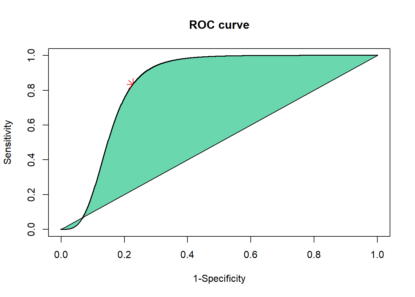
AUC_Logistic<-function (A,B,C,D){#binary data#A=True pos %B=False positive %C=False negative %D=True negative TPR=A/(A+C) FPR=1-(D/(D+B))#binomial distribution sqrt(np(1-p))#Statist. Med. 2002; 21:1237-1256 (DOI: 10.1002/sim.1099) STDa=sqrt((A+C)*TPR*(1-TPR)); STDn=sqrt((B+D)*FPR*(1-FPR)); a=STDn/STDa; theta=log((TPR/(1-TPR))/((FPR/(1-FPR))^a));#define a set of point from 0 to 1, separated by 0.001. X=seq(0,1,by=0.001) #logistic regression model Y1=(X^a)/(X^a+(((1-X)^a)*exp(-1*theta))); AUC=round(pracma::trapz(X,Y1),2) AUC#SE using Hanley & McNeil#Preferred method if more than one TPR,FPR data point known#Hanley is less conservative than Bamber Nn=B+D; Na=A+C; Q1=AUC/(2-AUC); Q2=2*AUC^2/(1+AUC);SEhanley=sqrt(((AUC*(1-AUC))+((Na-1)*(Q1-AUC^2))+((Nn-1)*(Q2-AUC^2)))/(Na*Nn))#SE using Bamber#Ns is the number of patients in the smallest groupif (A+C>B+D) { Ns=B+D } else { Ns=A+C }SEbamber=sqrt((AUC*(1-AUC))/(Ns-1))# plot smoothed ROCplot(X,Y1,main="ROC curve", xlab="1-Specificity",ylab="Sensitivity",cex=.25)points(FPR,TPR,pch=8,col="red",cex=2) #add pointY2=0polygon(c(X[X >=0& X <=1],rev(X[X >=0& X <=1])),c(Y1[X >=0& X <=1],rev(Y2[X >=0& X <=1])),col ="#6BD7AF")print(paste("The Area under the ROC curve using the logistic function is", AUC,". The Area under the ROC curve using rank sum method is", round(.5*(TPR+(1-FPR)),2)))}AUC_Logistic(10,20,2,68)
[1] "The Area under the ROC curve using the logistic function is 0.84 . The Area under the ROC curve using rank sum method is 0.8"
2.2 ggplot2
The plot below uses ggplot2 or grammar of graphics. The plot is built layer by layer like constructing a sentence. Plotting is a distinct advantage of R over commercial software with GUI (graphical user interface) like SPSS. A wide variety of media organisations (BBC, Economist) are using ggplot2 with their own stylised theme. The plot has a certain structure such the name of the data and aesthetics for x and y axes. For illustration purpose the aesthetics are labelled with x and y statements. The fill argument in the aesthetics indicate the variables for coloring.
There are different ways to use ggplot2: quick plot or qplot with limited options and full ggplot2 with all the options. The choice of the method depends on individual preference and as well as reason for plotting. This function qplot has now been deprecated to encourage users to learn ggplot.
To run the examples, check that you have install the libraries. an error can occurred if you don’t have the required library. The meta-character # is used to signal that the line is meant to comment the code ie R will not read it. The install.packages command only need to be run once.
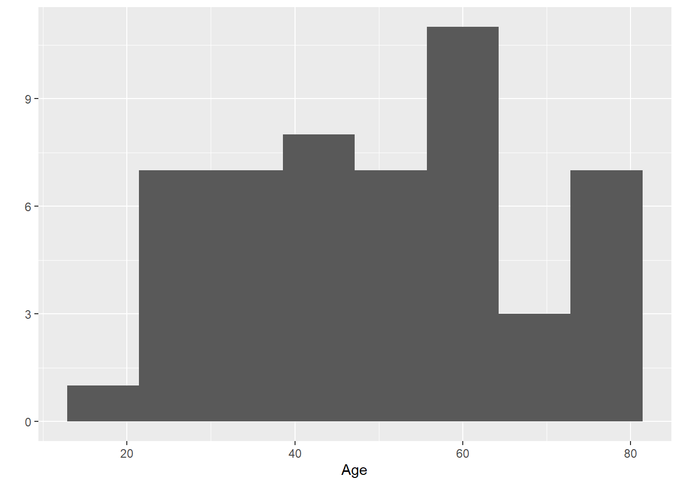
2.2.1 Histogram
The flexibility of ggplot2 is shown here in this histogram. The legend can be altered using the scale_fill_manual function. If other colours are preferred then under values add the preferred colours.
library(ggplot2)
Warning: package 'ggplot2' was built under R version 4.3.3
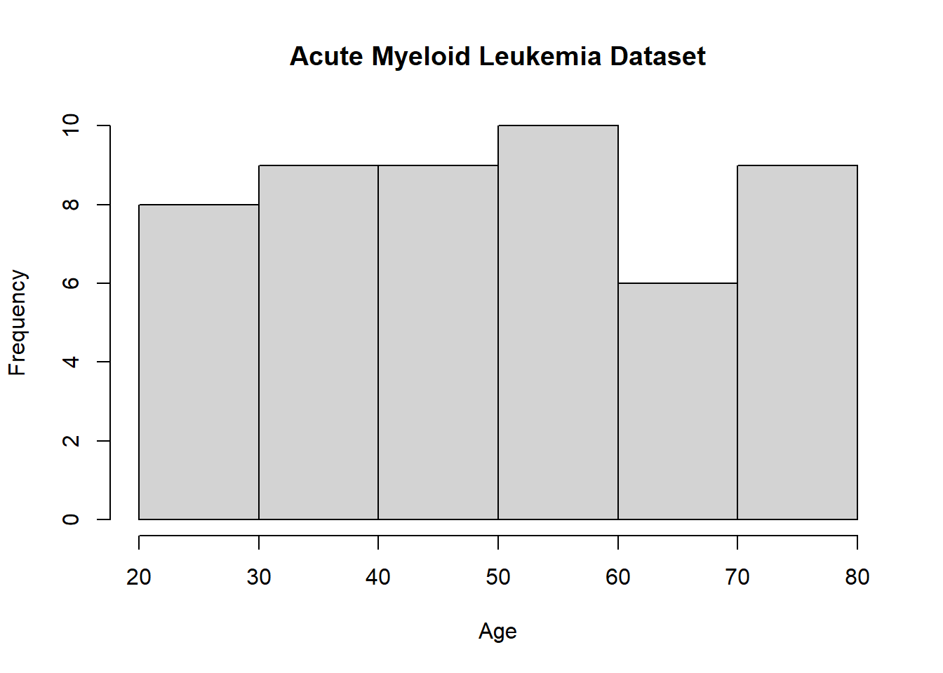
#qplotqplot(Age, data=Leukemia, bins=8)
Warning: `qplot()` was deprecated in ggplot2 3.4.0.
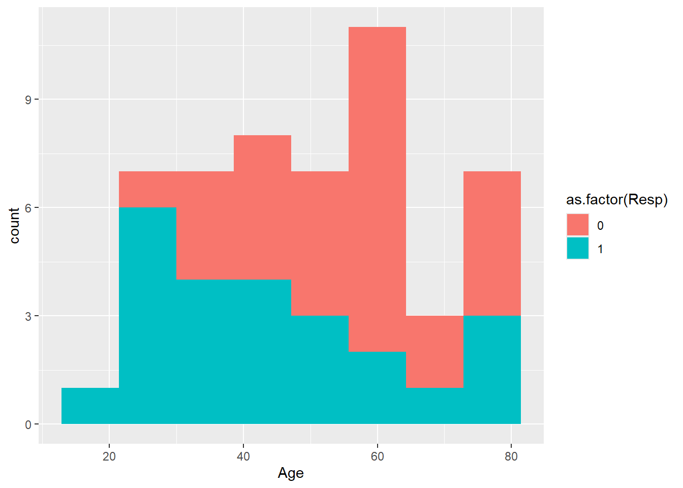
Now a more complex version of histogram using ggplot with color added.
Note the legend is a bit untidy. The legend can be changed using scale_fill_manual. The color can be specified using rgb argument. This is important as some journals prefer certain color.
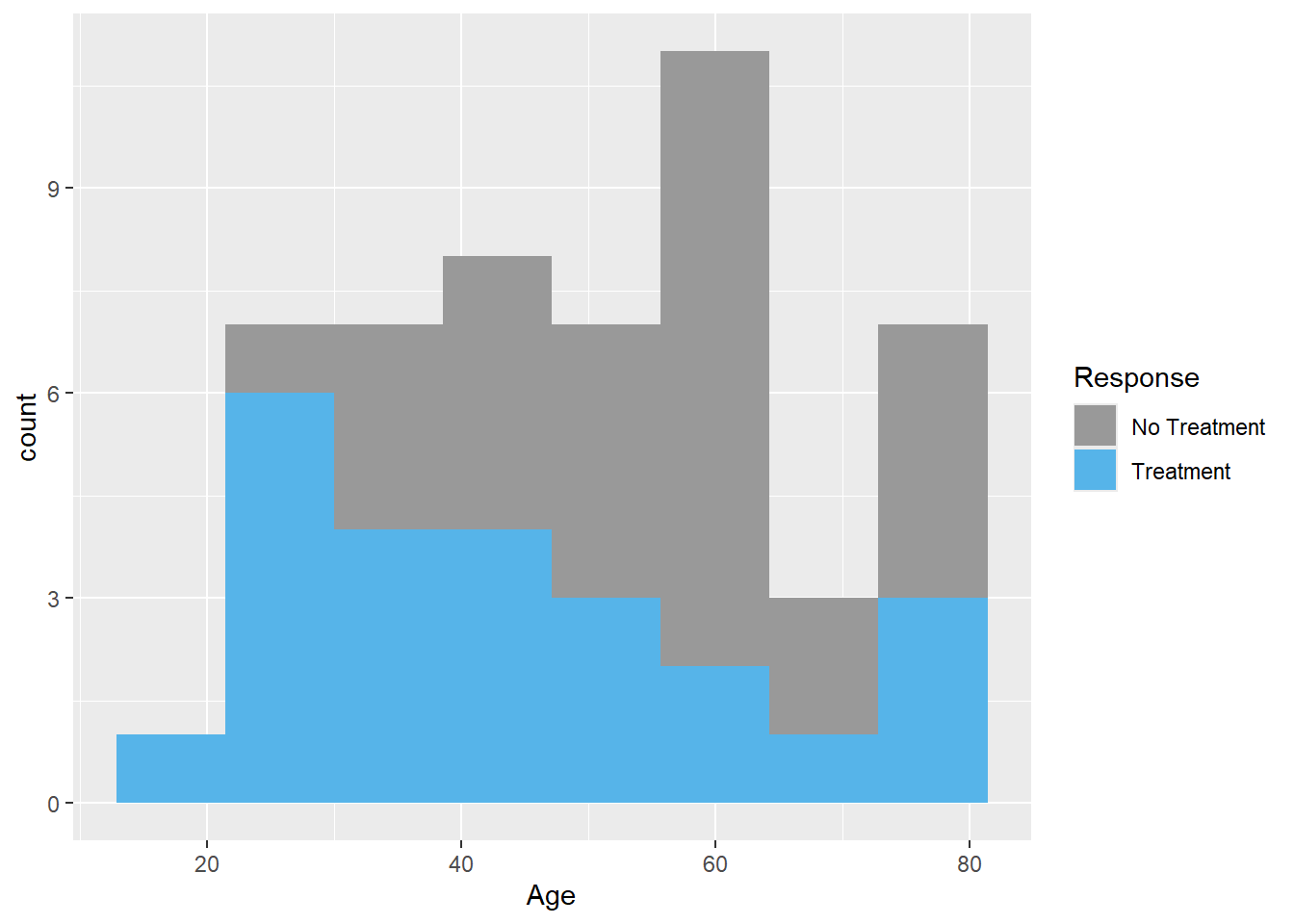
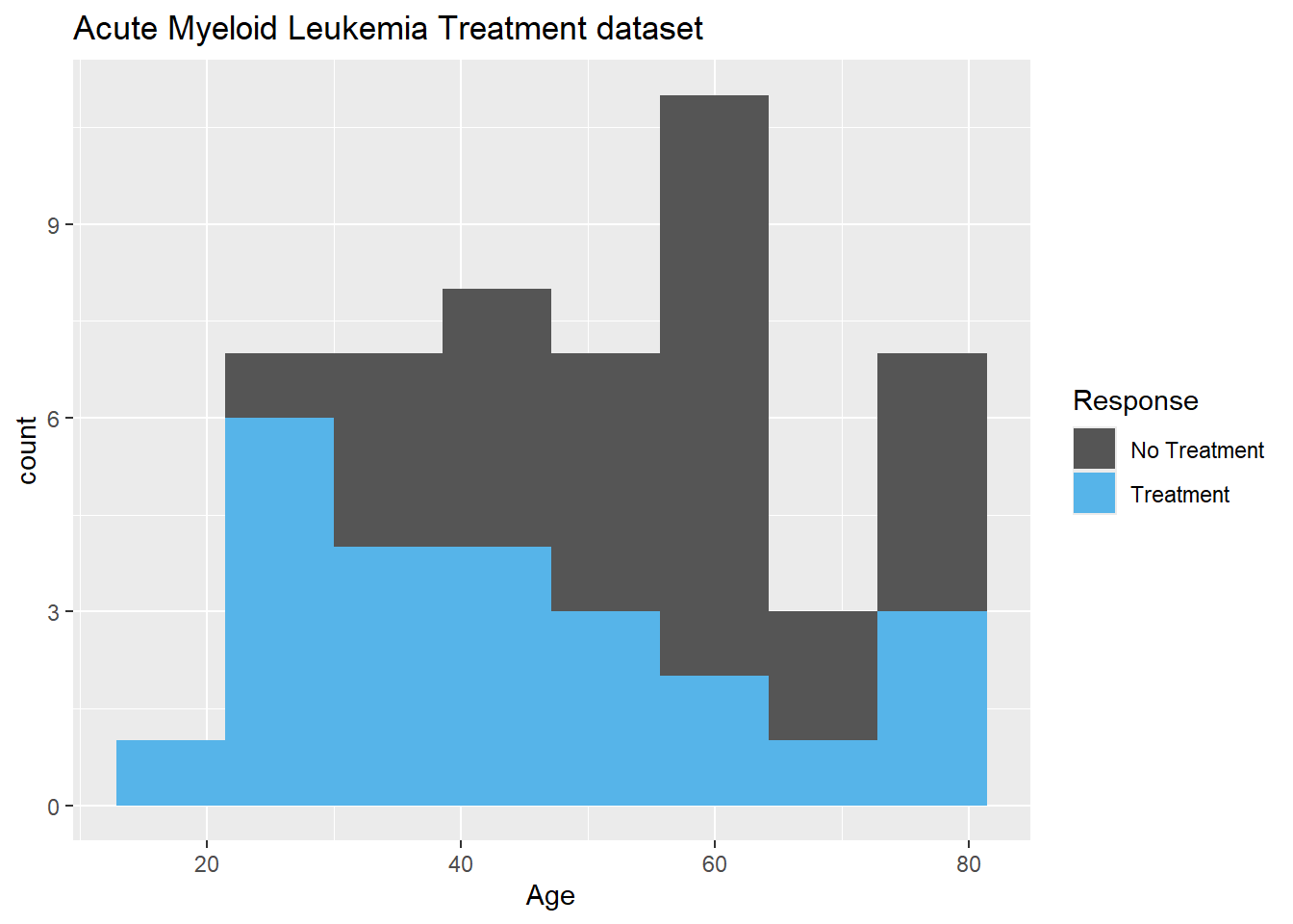
#adding legend, changing the values 0 and 1 to treatment responseggplot(data=Leukemia,aes(Age,fill=as.factor(Resp)))+geom_histogram(bins=8)+scale_fill_manual(name="Response",values=c("#999999","#56B4E9"),breaks=c(0,1),labels=c("No Treatment","Treatment"))
Previously, we had used base R for bar plot. Here we use the geom_bar argument in ggplot.
library(ggplot2)library(extrafont)
Registering fonts with R
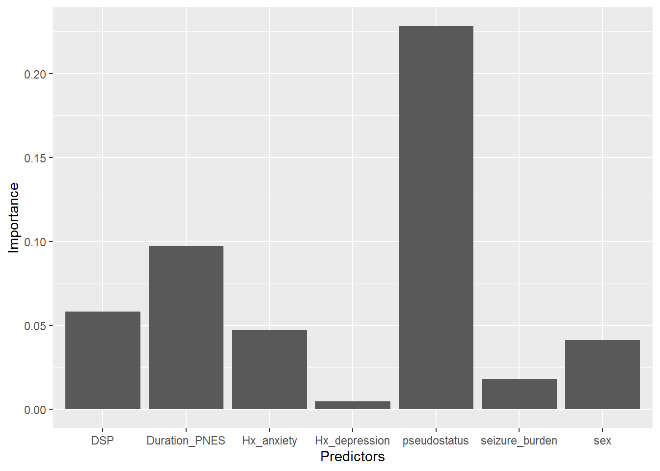
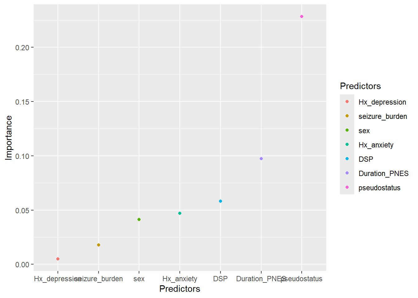
#this data came from a paper published in Epilespia 2019 on cost of looking #after patients with pseudoseizure ## Lower Upper## percentage 0.95 0.95 ## Duration_PNES.lmg 0.0974 0.0057 0.2906## pseudostatus.lmg 0.2283 0.0687 0.3753## Hx_anxiety.lmg 0.0471 0.0057 0.1457## Hx_depression.lmg 0.0059 0.0041 0.1082## DSP.lmg 0.0582 0.0071 0.1500## seizure_burden.lmg 0.0179 0.0041 0.1058## sex.lmg 0.0413 0.0030 0.1519df<-data.frame("Predictors"=c("Duration_PNES","pseudostatus","Hx_anxiety","Hx_depression","DSP","seizure_burden","sex"),"Importance"=c(0.09737,0.22825, 0.047137,0.00487,0.058153,0.01786,0.04131),"Lower.95"=c(0.0057,0.0687,0.0057,0.0041,0.0071,0.0041,0.0030),"Upper.95"=c(0.2906,0.3753,0.1457,0.1082,0.1500,0.1058,0.1519))#check dimensions of data framedim(df)
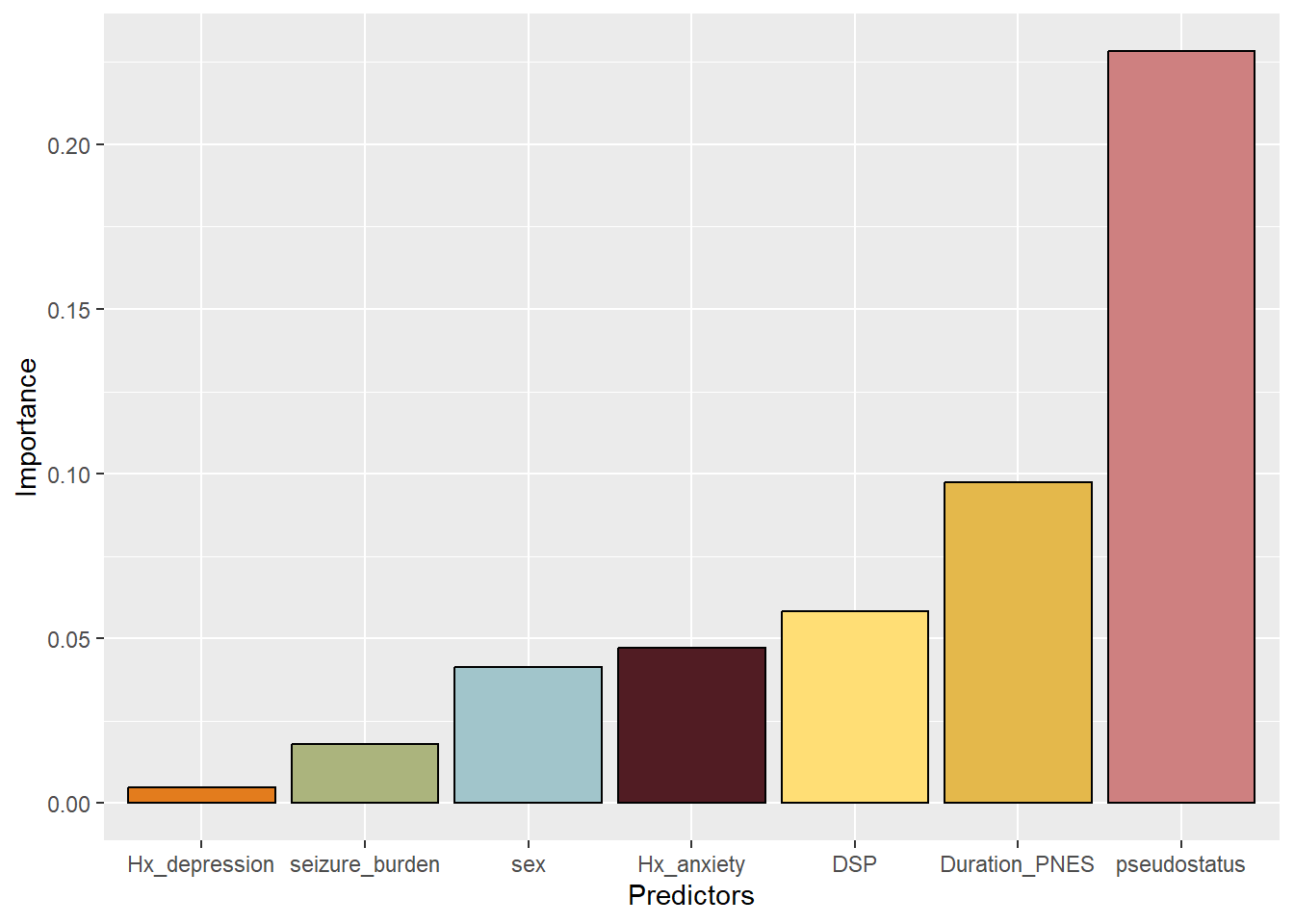
This bar plot may be considered as untidy as the variables have not been sorted. Reordering the data requires ordering the factors. The colors were requested by the journal Epilesia in order to aid recognition of the bar by readers with color blindness (Seneviratne et al. 2019).
#reordering the datadf3<-df2<-dfdf3$Predictors<-factor(df2$Predictors, levels=df2[order(df$Importance),"Predictors"])#adding colorp<-ggplot(df3, aes(x=Predictors,y=Importance,fill=Predictors))+geom_bar(colour="black",stat="identity",fill=c("#e4b84b","#ce8080","#511c23","#e37c1d","#ffde75","#abb47d","#a1c5cb"))p
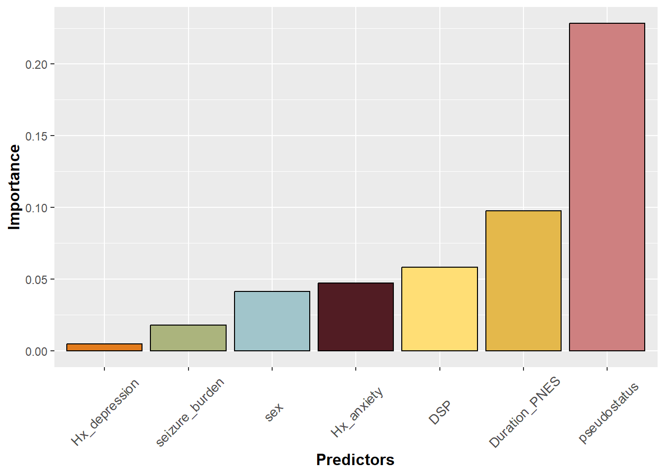
This bar plot is now ordered but the labels on the axis seem to run into each other. One solution is to tile the axis title using element_text. Note that the text size can also be specified within this argument.
#rotate legend on x axis label by 45p+theme(axis.title.y =element_text(face="bold", size=12),axis.title.x =element_text(face="bold", size=12), axis.text.x =element_text(angle=45, vjust=0.5, size=10))
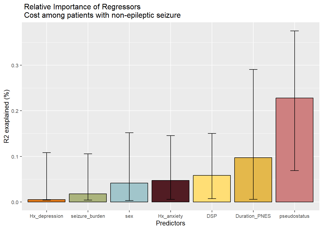
The title can be broken up using the backward slash.
#adding break in titlep1<-p+geom_errorbar(aes(ymin=Lower.95,ymax=Upper.95,width=0.2))+labs(y="R2 exaplained (%)")+theme(text=element_text(size=10))+ggtitle(" Relative Importance of Regressors \n Cost among patients with non-epileptic seizure")p1
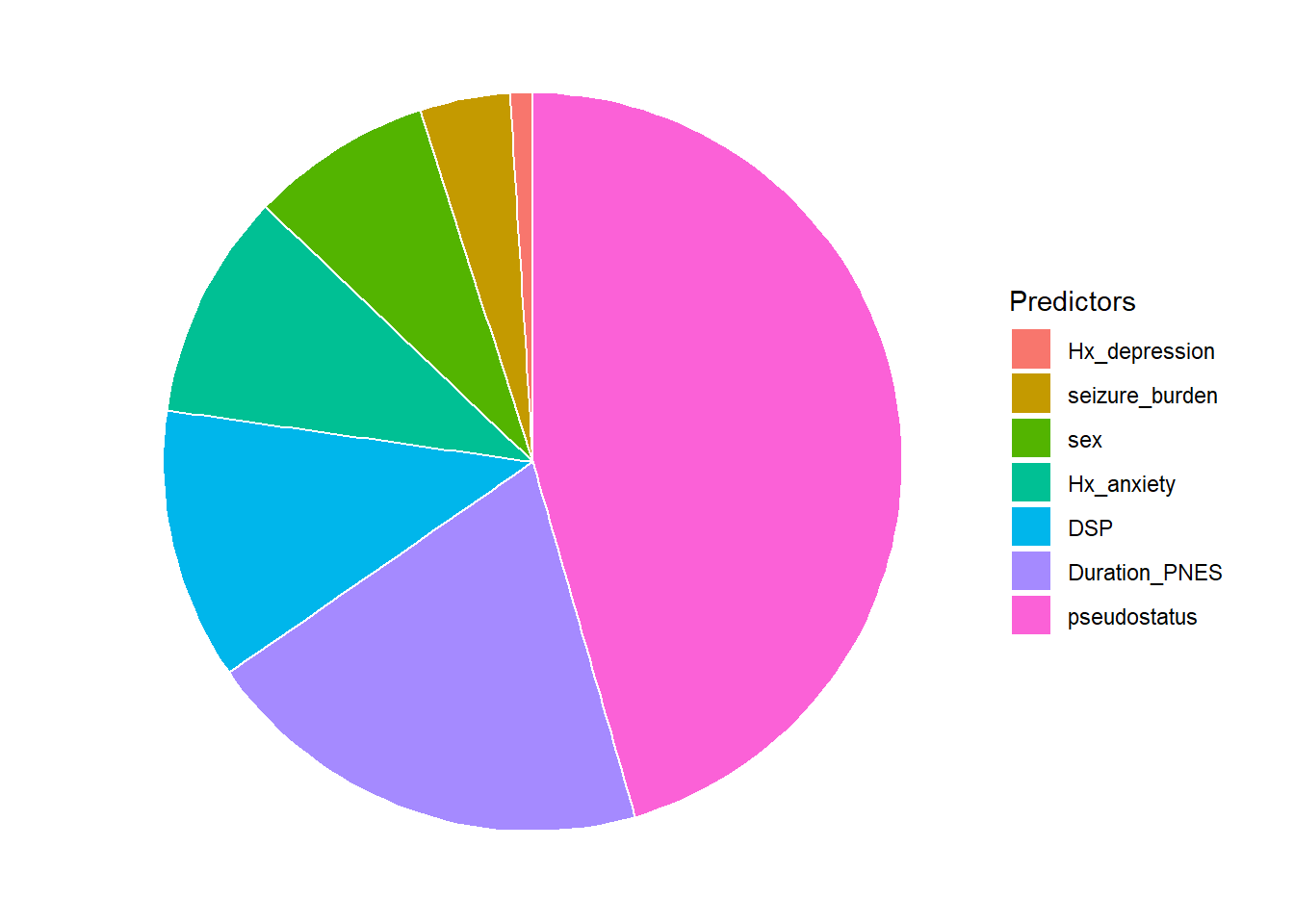
2.2.3 Pie chart
This example uses the data above on contribution of non-epileptic seizure variables to hospitalised cost.
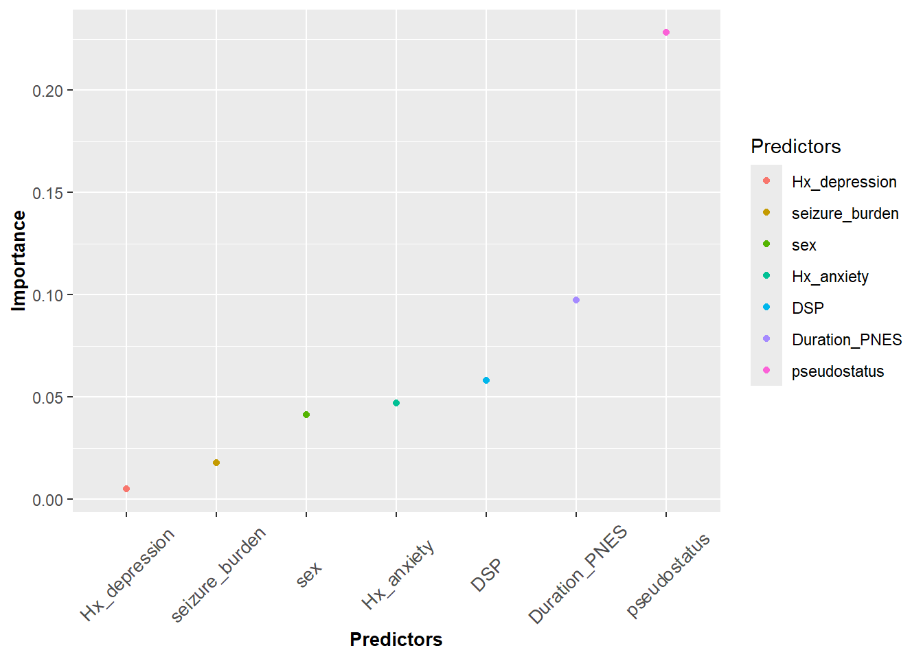
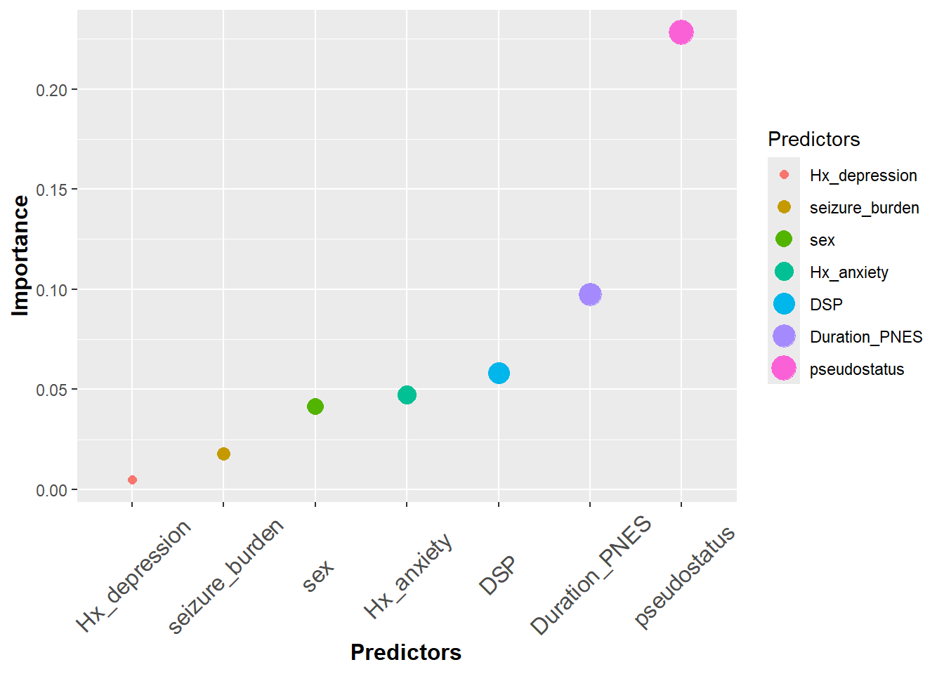
The above data is used here to illustrate scatter plot. We can denote the color difference among the Predictors by adding color argument in the aesthetics.
#color in qplotqplot(data=df3, Predictors, Importance,color=Predictors)
Warning: Using size for a discrete variable is not advised.
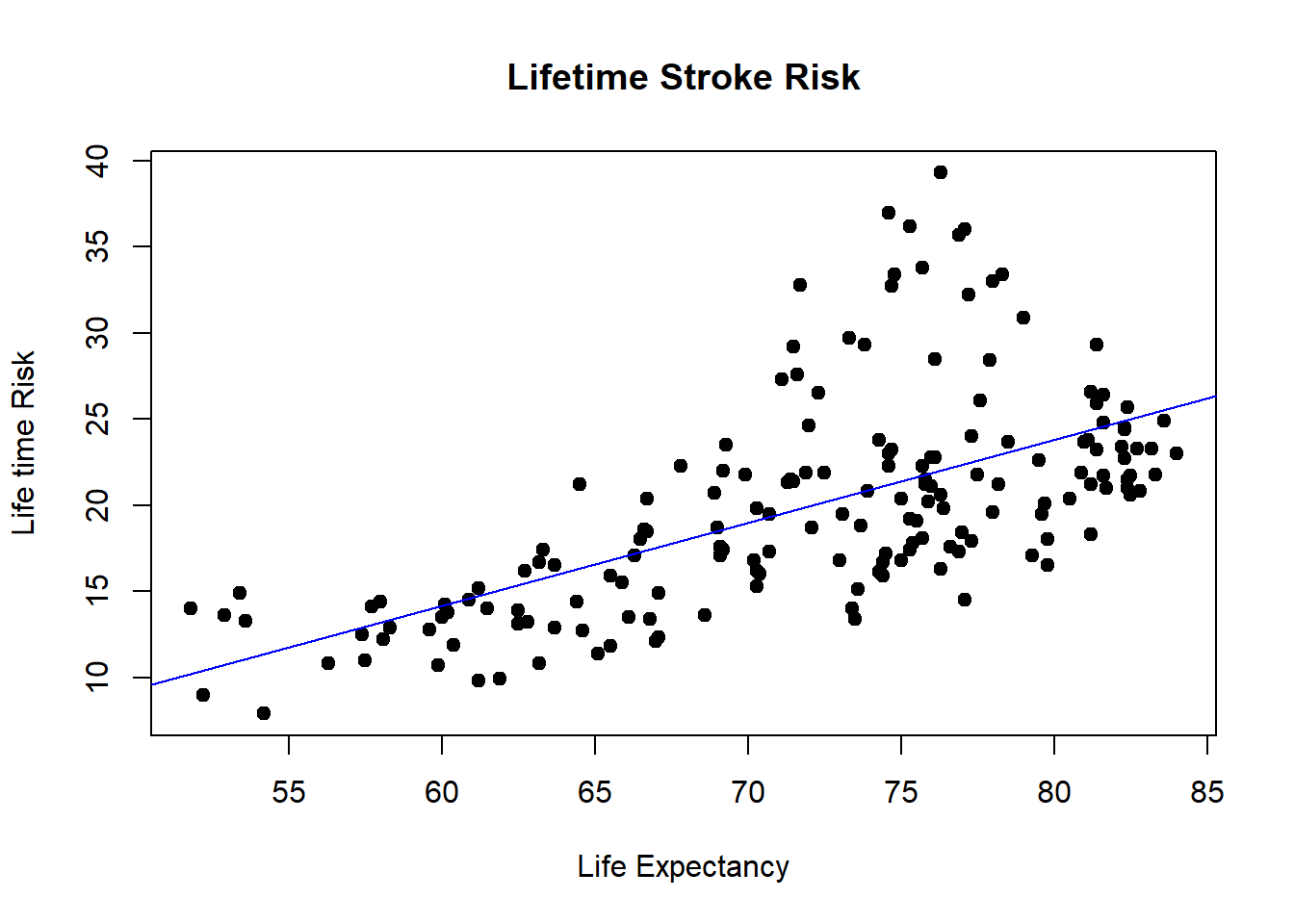
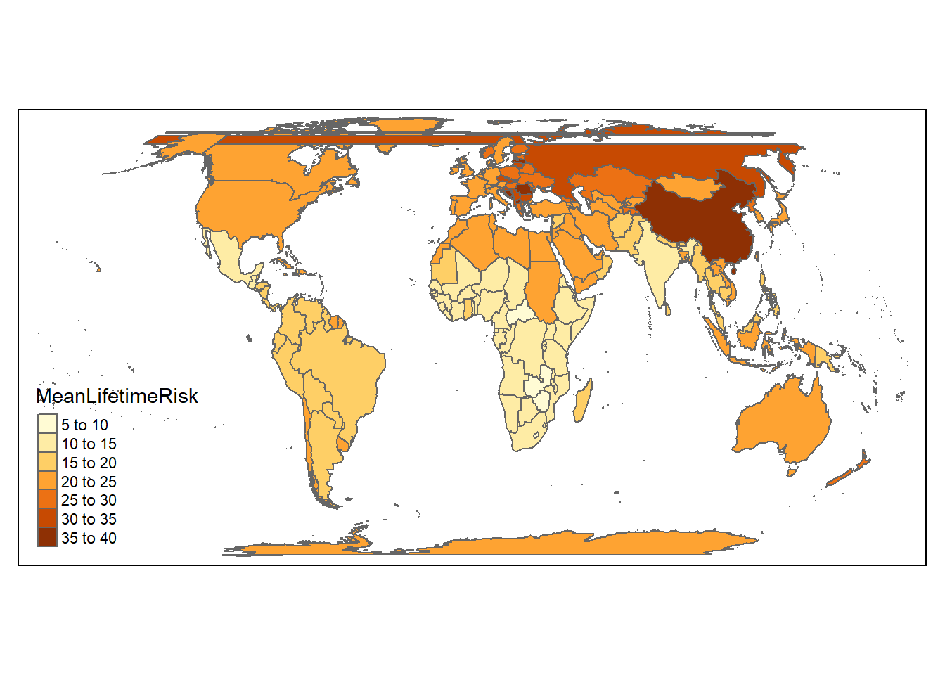
This is a more complicated example of scatter plot combined with formula of regression line. The paste0 function is used to add the equation to the plot. The data comes from GBD 2016 publication on lifetime risk of stroke. A comparison with plotting from base R is also provided.
library(tidyverse)
── Attaching core tidyverse packages ──────────────────────── tidyverse 2.0.0 ──
✔ dplyr     1.1.2     ✔ readr     2.1.4
✔ forcats   1.0.0     ✔ stringr   1.5.0
✔ lubridate 1.9.2     ✔ tibble    3.2.1
✔ purrr     1.0.1     ✔ tidyr     1.3.0
── Conflicts ────────────────────────────────────────── tidyverse_conflicts() ──
✖ dplyr::filter() masks stats::filter()
✖ dplyr::lag()    masks stats::lag()
ℹ Use the conflicted package (<http://conflicted.r-lib.org/>) to force all conflicts to become errors
load("./Data-Use/world_stroke.Rda")#fitting a regression modelfit<-lm(MeanLifetimeRisk~LifeExpectancy,data=world_sfdf)fitsum<-summary(fit)#base R scatter plot with fitted linex=world_sfdf$LifeExpectancy #define xy=world_sfdf$MeanLifetimeRisk #define yplot(x,y, data=world_sfdf, main ="Lifetime Stroke Risk",xlab ="Life Expectancy", ylab ="Life time Risk",pch =19)abline(lm(y ~ x, data = world_sfdf), col ="blue")
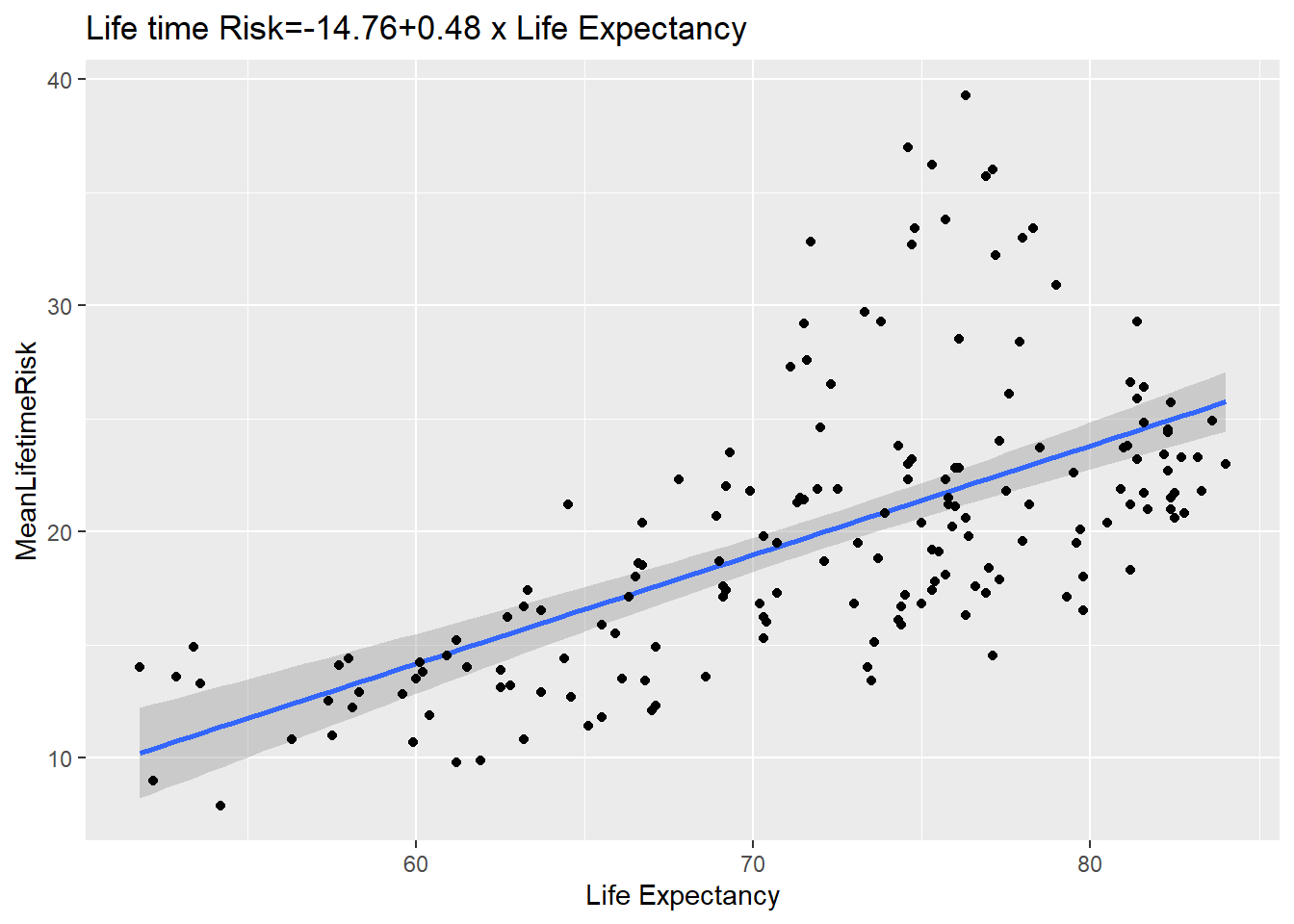
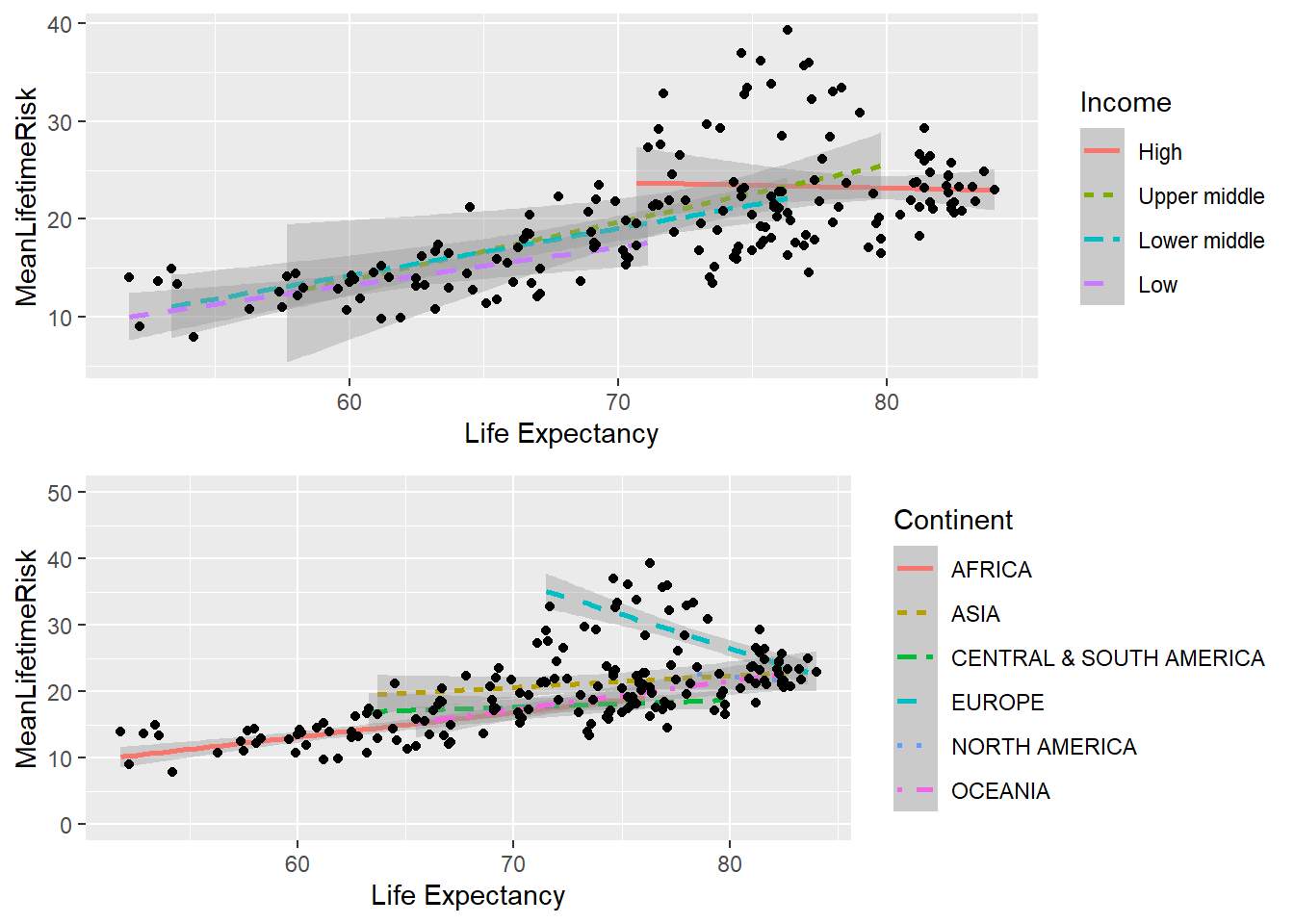
The ggplot version is now provided. Note that the line is fitted in the geom_smooth argument. An interesting aspect of this plot is that the data can be describe as heterosecadic in which the variance changes throughout the plot. The plot suggests that a mixed model strategy rather than linear regression is the best way to describe the data.
#ggplot2 scatter plot with fitted lineSR<-ggplot(world_sfdf, aes(x=LifeExpectancy,y=MeanLifetimeRisk))+geom_smooth(method="lm")+geom_point()+xlab("Life Expectancy")+ggtitle(paste0("Life time Risk", "=", round(fitsum$coefficients[1],2),"+",round(fitsum$coefficients[2],2)," x ","Life Expectancy"))SR
`geom_smooth()` using formula = 'y ~ x'
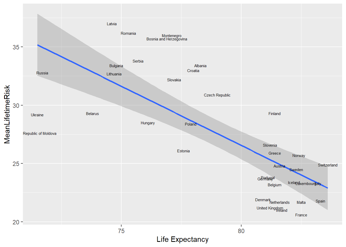
To use the name of the country as label, we use geom_text. The world_sfdf data is now partitioned to show only data from Europe. An interesting pattern emerge. There is clumping of the data around Belgium and Portugal. The nudge_x and nudge_y function are used to adjust the labels and the size argument adjust the label.
library(tidyverse)library(sf)
Linking to GEOS 3.11.2, GDAL 3.6.2, PROJ 9.2.0; sf_use_s2() is TRUE
old-style crs object detected; please recreate object with a recent sf::st_crs()
`geom_smooth()` using formula = 'y ~ x'
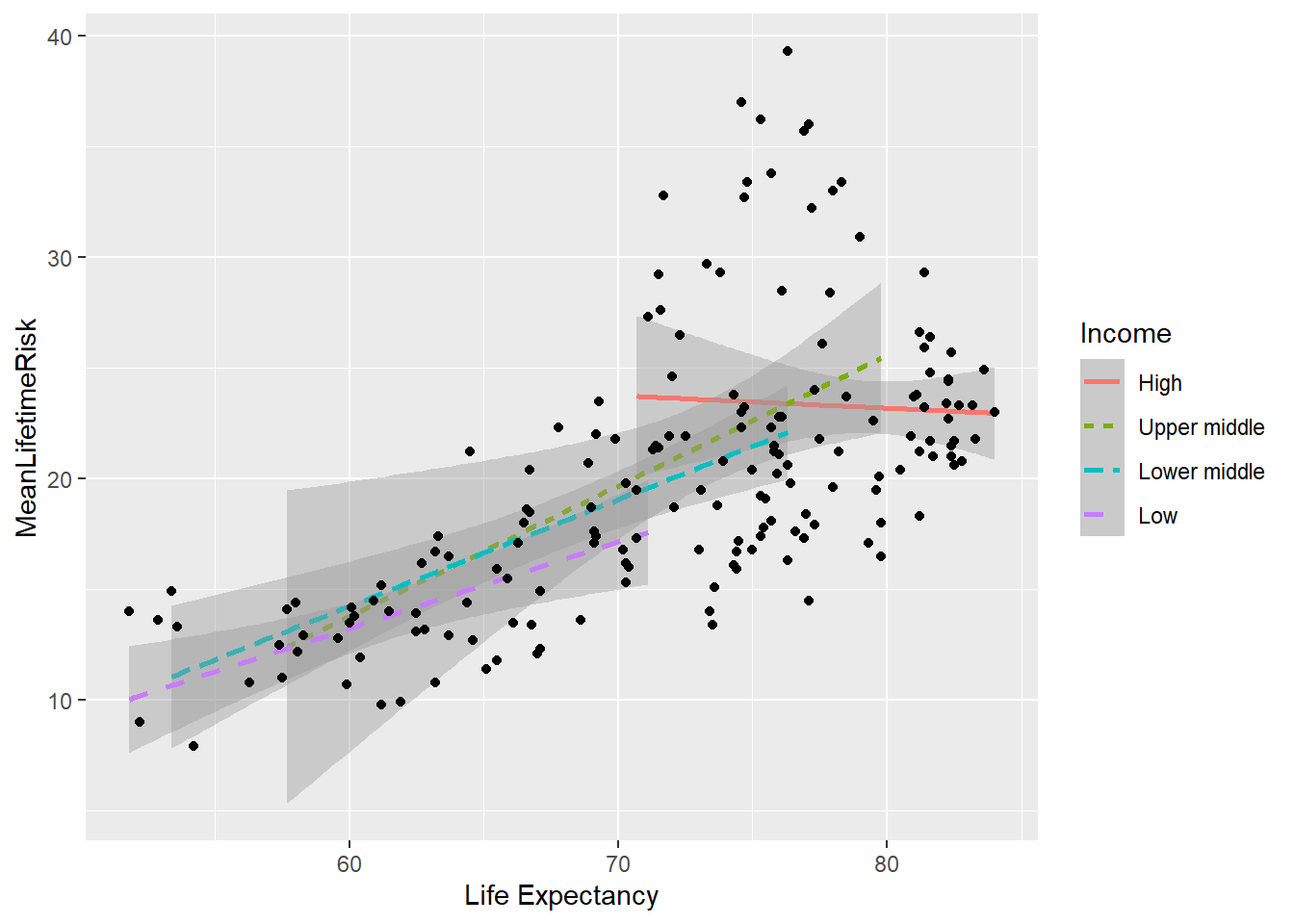
In order to understand the reason for deviations from the fitted line above, it is possible possible to add additional step to explore the relationship for each income group. This graph illustrates that the high income countries have a ceiling in the relationship between lifetime risk and life expectancy from age of 70 onward.
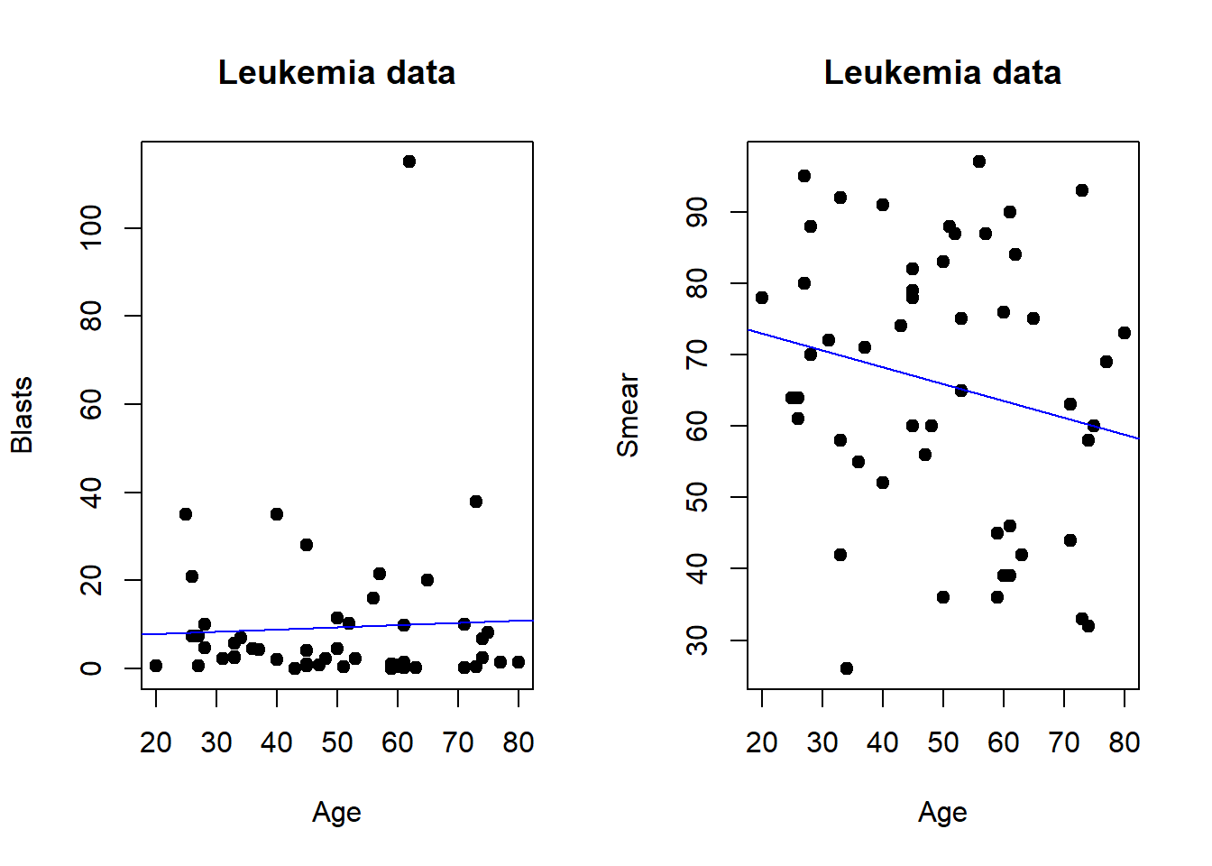
Plots can be arrange in tabular format for presentation or journal submission.In base R multiple plots can be combined using par function and specify the number of columns by mfrow. The number of columns can be specified with ncol call when using gridExtra library.
#Leukemia datapar(mfrow=c(1,2)) #row of 1 and 2 columnsx=Leukemia$Age #define xy=Leukemia$Blasts #define yplot(x,y, data=Leukemia, main ="Leukemia data",xlab ="Age", ylab ="Blasts",pch =19)abline(lm(y ~ x, data = Leukemia), col ="blue")y1=Leukemia$Smearplot(x,y1, data=Leukemia, main ="Leukemia data",xlab ="Age", ylab ="Smear",pch =19)abline(lm(y1 ~ x, data = Leukemia), col ="blue")
library(gridExtra)
Attaching package: 'gridExtra'
The following object is masked from 'package:dplyr':

    combine
An alternative way to display multiple plots is to use patchwork library.
library(patchwork)SRIncome/SRContinent
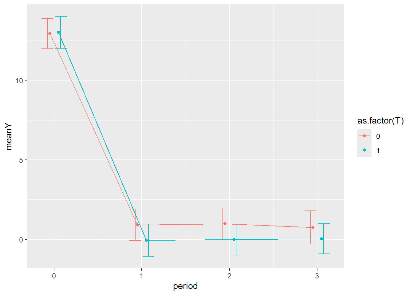
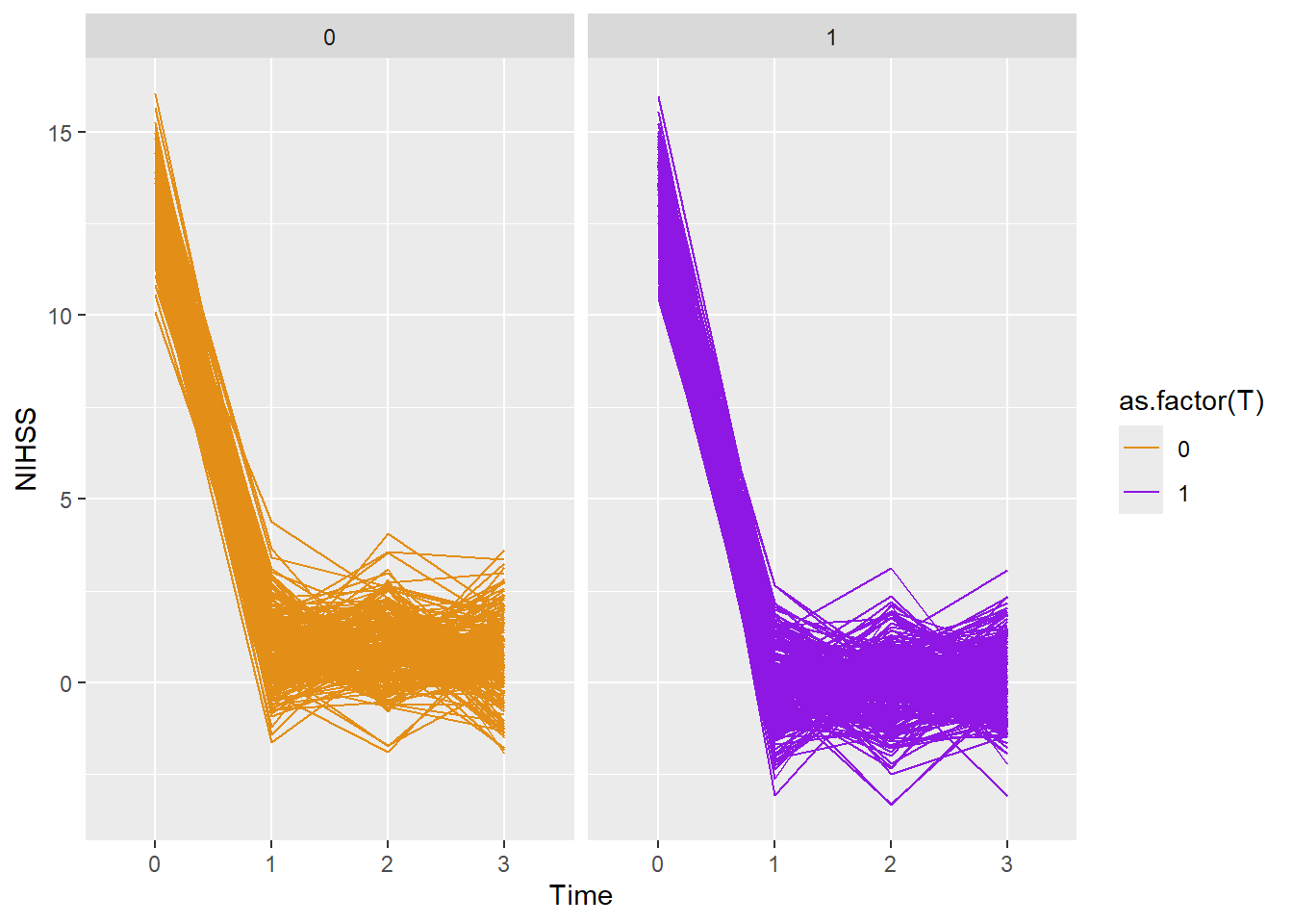
2.2.6 Line plot
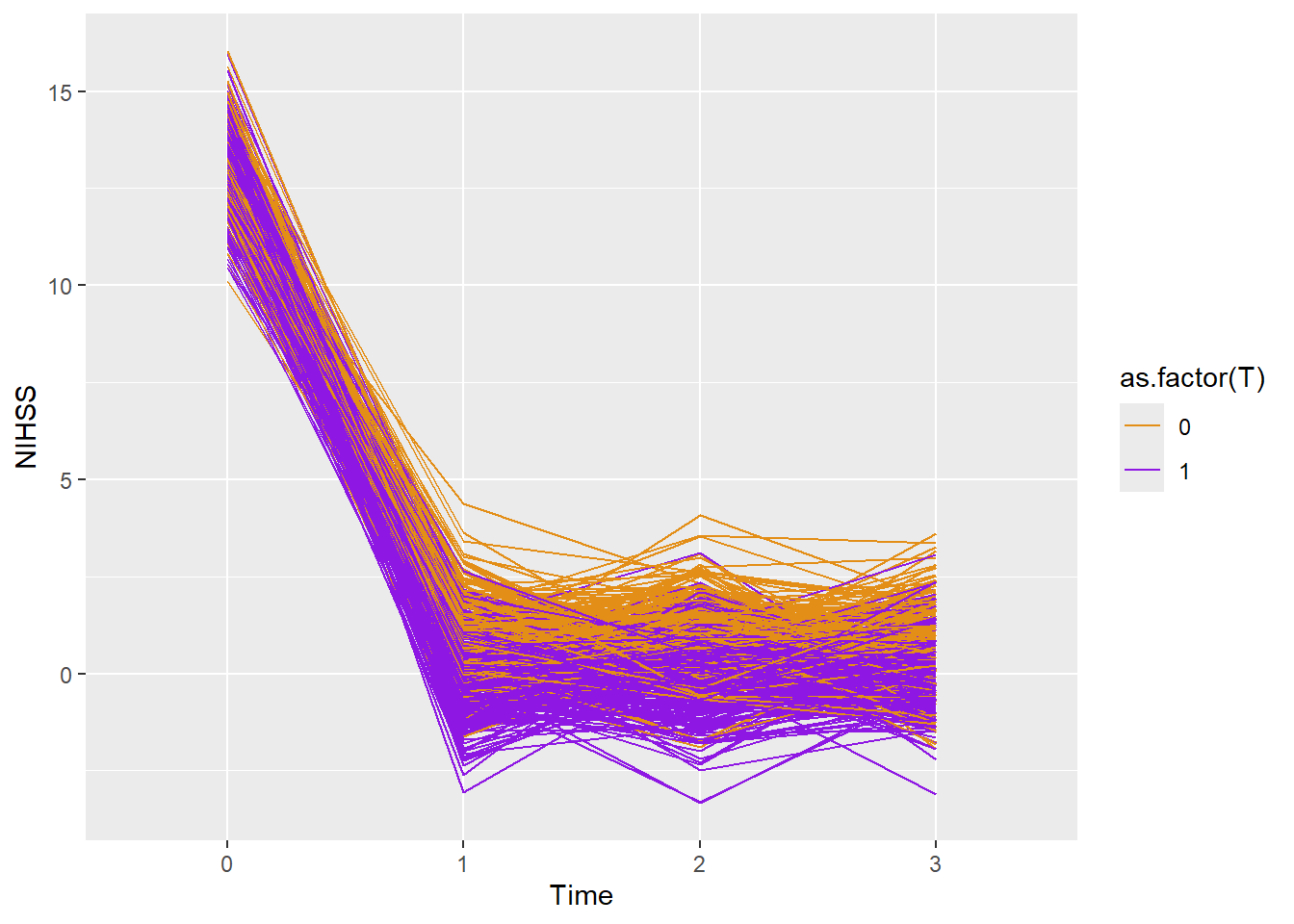
The data below is generated in the section on data simulation. The data were simulated using summary data from recent clot retrieval trials in stroke Campbell et al. (2015)
library(ggplot2)library(dplyr)dtTime<-read.csv("./Data-Use/dtTime_simulated.csv")dtTrial<-read.csv("./Data-Use/dtTrial_simulated.csv")#summarise data using group_bydtTime2<-dtTime %>%group_by(period, T) %>%summarise(meanY=mean(Y),sdY=sd(Y),upperY=meanY+sdY,lowerY=meanY-sdY)
`summarise()` has grouped output by 'period'. You can override using the
`.groups` argument.
#individual line plotggplot(dtTime,aes(x=as.factor(period),y=Y))+geom_line(aes(color=as.factor(T),group=id))+scale_color_manual(values =c("#e38e17", "#8e17e3")) +xlab("Time")+ylab("NIHSS")
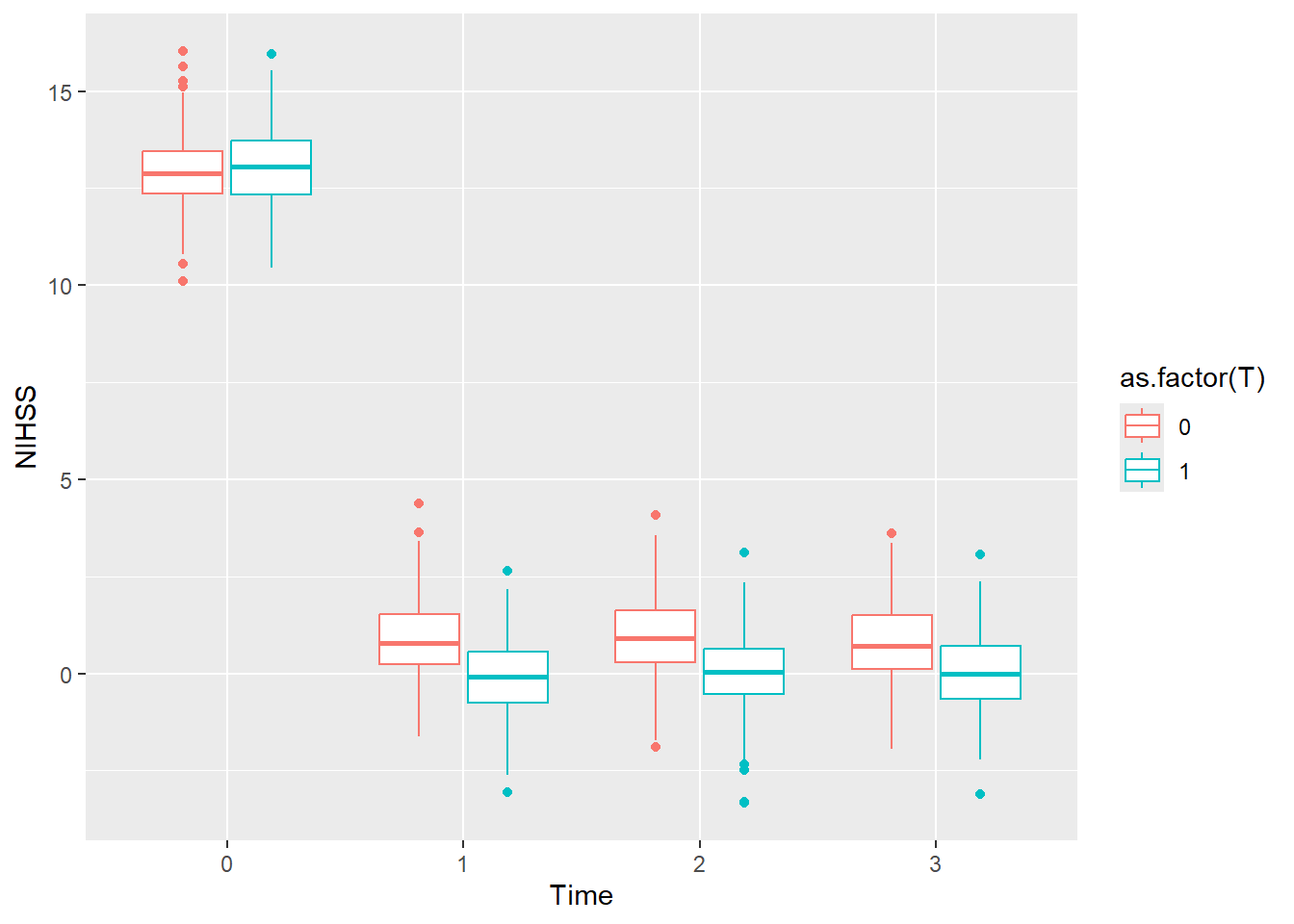
The line plot can also be represented as boxplot without the connecting lines.
To perform line plot on the grouped data, first fit the regression line to the grouped data.
#linear regression Y1 predict Y2 where Y1 and Y2 are grouped data #from the simulated data above.fit<-lm(Y1~Y0+T, data=dtTrial)dtTrial2<-filter(dtTrial, T==1)fit2<-lm(Y2~Y1, data=dtTrial2)#line plot by grouppd <-position_dodge2(width =0.2) # move them .2 to the left and rightgbase =ggplot(dtTime2, aes(y=meanY, colour=as.factor(T))) +geom_errorbar(aes(ymin=lowerY, ymax=upperY), width=.3, position=pd)+geom_point(position=pd) gline = gbase +geom_line(position=pd) dtTime2$period=as.numeric(dtTime2$period)unique((dtTime2$period))
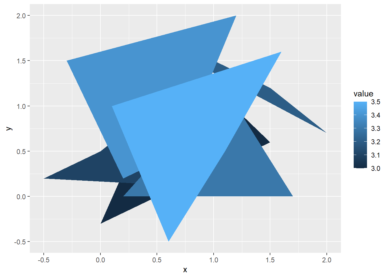
The geom_polygon is often used in thematic plot of maps. It can be used to show polygons outside of map. It requires one data frame for coordinate and another for the values.
#simulate dataids <-factor(c("1", "2", "3", "4","5","6"))values <-data.frame(id = ids,value =c(3, 3.1, 3.2, 3.3,3.4,3.5))a=seq(0,1.5,by=0.5)x=c(a,a-.5,a+.5,a+.2, a-.3,a+.1)positions <-data.frame(id =rep(ids, each =4),x=c(a,a-.5,a+.5,a+.2, a-.3,a+.1),y=sample(x) )# Currently we need to manually merge the two togethercomb <-merge(values, positions, by =c("id"))p <-ggplot(comb, aes(x = x, y = y)) +geom_polygon(aes(fill = value, group = id))p
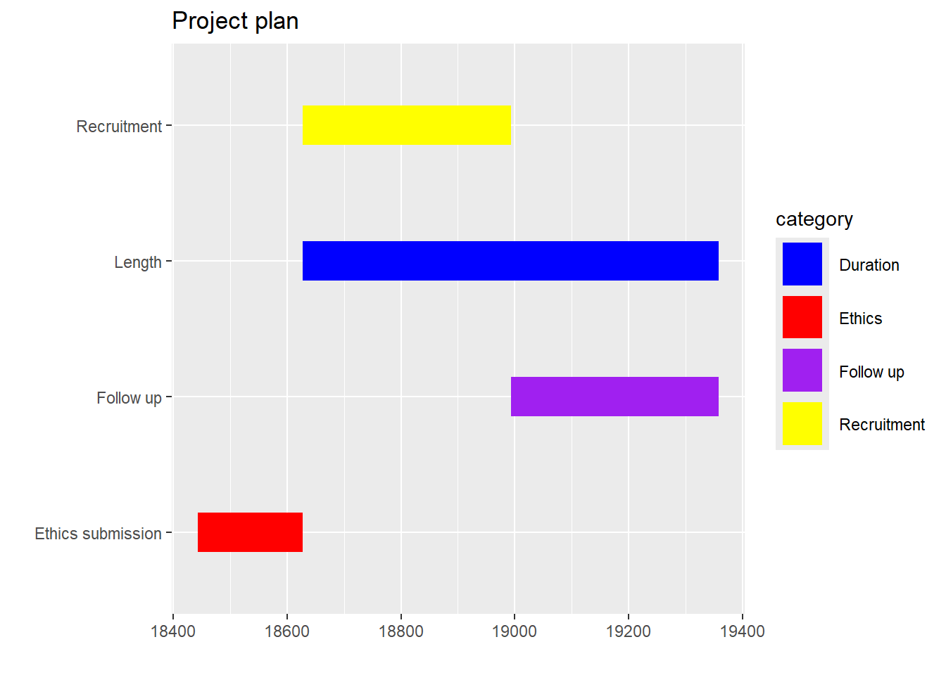
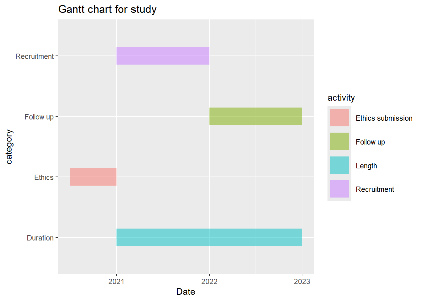
2.2.9 Gantt chart
Gantt chart can be used to illustrate project timeline. It needs a minimum of 4 data columns: Activity, Project, a start date and end date. This example below is meant as a template. If you have 6 rows of data then add 2 extra rows of data including colors.
library(tidyverse)library(lubridate)gantt_df<-data.frame(item=seq(1:4), activity=c("Ethics submission","Length","Recruitment","Follow up"),category=c("Ethics","Duration","Recruitment","Follow up"),Start=c("2020-06-30","2021-01-01","2021-01-01","2022-01-01"),End=c("2021-01-01","2023-01-01","2022-01-01","2023-01-01")) %>%mutate(Start=as.Date(Start, origin="1970-01-01" ),End=as.Date(End, origin="1970-01-01")#,#Set factor level to order the activities on the plot#activity=factor(activity,levels=activity[1:nrow(gantt_df)]), #category=factor(category,levels=category[1:nrow(gantt_df)]) )#geom_linerange requires specification of min and maxplot_gantt <-qplot(ymin = Start,ymax = End,x = activity,colour = category,geom ="linerange",data = gantt_df,size =I(10)) +#width of linescale_colour_manual(values =c("blue", "red", "purple", "yellow")) +coord_flip() +xlab("") +ylab("") +ggtitle("Project plan")plot_gantt
Note that there’s an error from conversion of Date to numeric. More about this is available in Data Wrangling chapter.
as.numeric(gantt_df$Start)
[1] 18443 18628 18628 18993
This is a ggplot version of the above data. It requires conversion of the data into long format.
You have loaded plyr after dplyr - this is likely to cause problems.
If you need functions from both plyr and dplyr, please load plyr first, then dplyr:
library(plyr); library(dplyr)
The following plots retains the framework of ggplot2. Their uses require installing additional libraries.
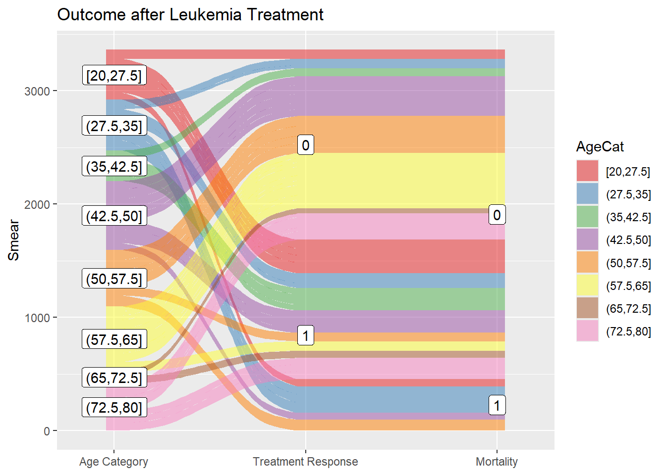
2.3.1 Alluvial and Sankey diagram
The Sankey flow diagram uses the width of the arrow used to indicate the flow rate. It is often used to indicate energy dissipation in the system. There are several libraries providing Sankey plot such as networkD3 library. Alluvial plot is a subset of Sankey diagram but differs in having a structured workflow. The ggalluvial library is chosen here for demonstration as it forms part of the ggplot2 framework.
library(ggalluvial)library(Stat2Data)data("Leukemia") #treatment of leukemia#partition Age into 8 ordered factorsLeukemia$AgeCat<-cut_interval(Leukemia$Age, n=8, ordered_result=TRUE)#axis1ggplot(data=Leukemia, aes (y=Smear,axis1=AgeCat, axis2=Resp,axis3=Status))+geom_alluvium(aes(fill=AgeCat),width =1/12)+geom_label(stat ="stratum", infer.label =TRUE) +geom_label(stat ="stratum", infer.label =TRUE)+scale_x_discrete(limits =c("AgeCat","Resp", "Status"),label=c("Age Category","Treatment Response","Mortality"), expand =c(.1, .1)) +scale_fill_brewer(type ="qual", palette ="Set1") +ggtitle("Outcome after Leukemia Treatment")
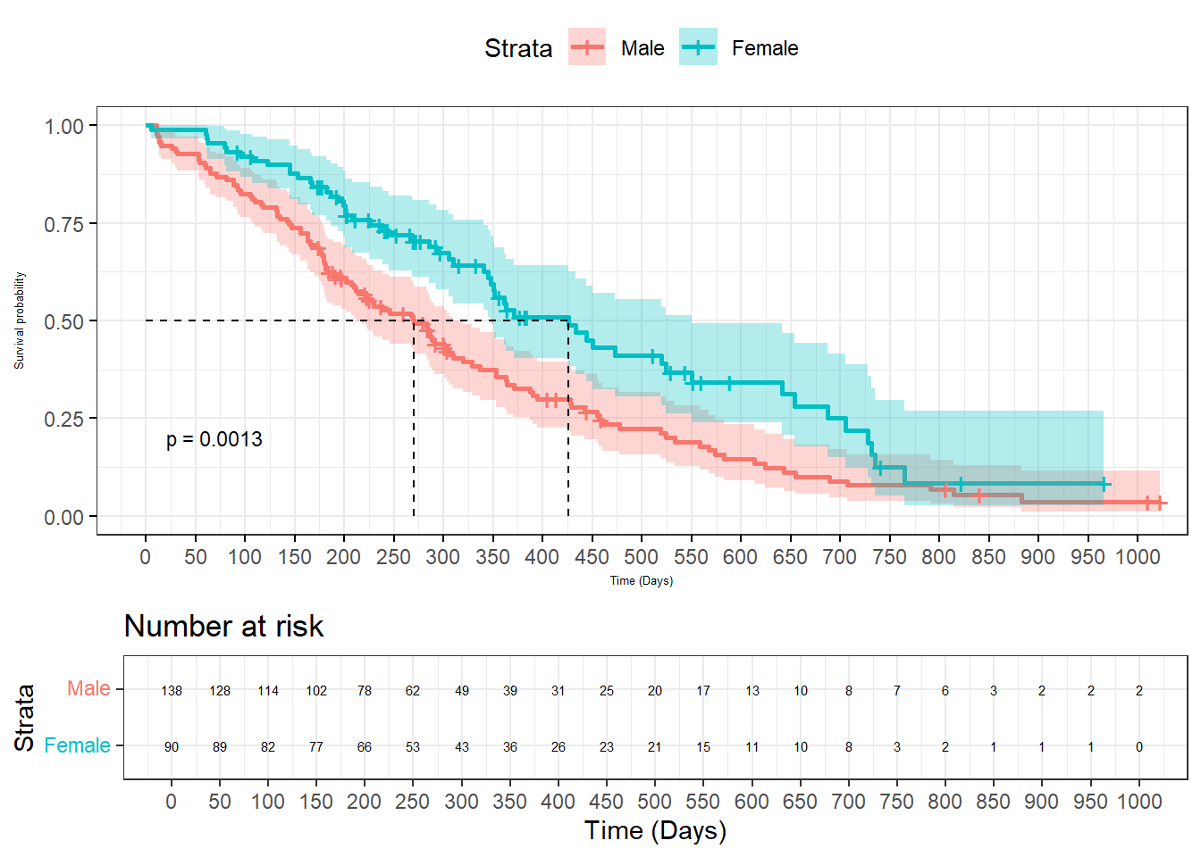
2.3.2 Survival plot
The survminer library extends ggplot2 style to survival plot. It requires several libraries such as survival for survival analysis and lubridate to parse time. A description of survival analysis is provided in the Statistics section.
library(survminer)
Loading required package: ggpubr
Attaching package: 'ggpubr'
The following object is masked from 'package:plyr':

    mutate
library(lubridate)library(survival)
Attaching package: 'survival'
The following object is masked from 'package:survminer':

    myeloma
data(cancer, package="survival")#data from survival package on NCCTG lung cancer trial#https://stat.ethz.ch/R-manual/R-devel/library/survival/html/lung.html#time in days#status cesored=1, dead=2sex:#sex:Male=1 Female=2sfit<-survfit(Surv(time, status) ~ sex, data = cancer)ggsurvplot(sfit, data=cancer,surv.median.line ="hv",pval=TRUE,pval.size=3, conf.int =TRUE,legend.labs=c("Male","Female"),xlab="Time (Days)", break.time.by=50,font.x=5,font.y=5,ggtheme =theme_bw(), risk.table=T,risk.table.font=2, #adjust fontrisk.table.height=.3#adjust table height )
2.3.3 ggraph and tidygraph
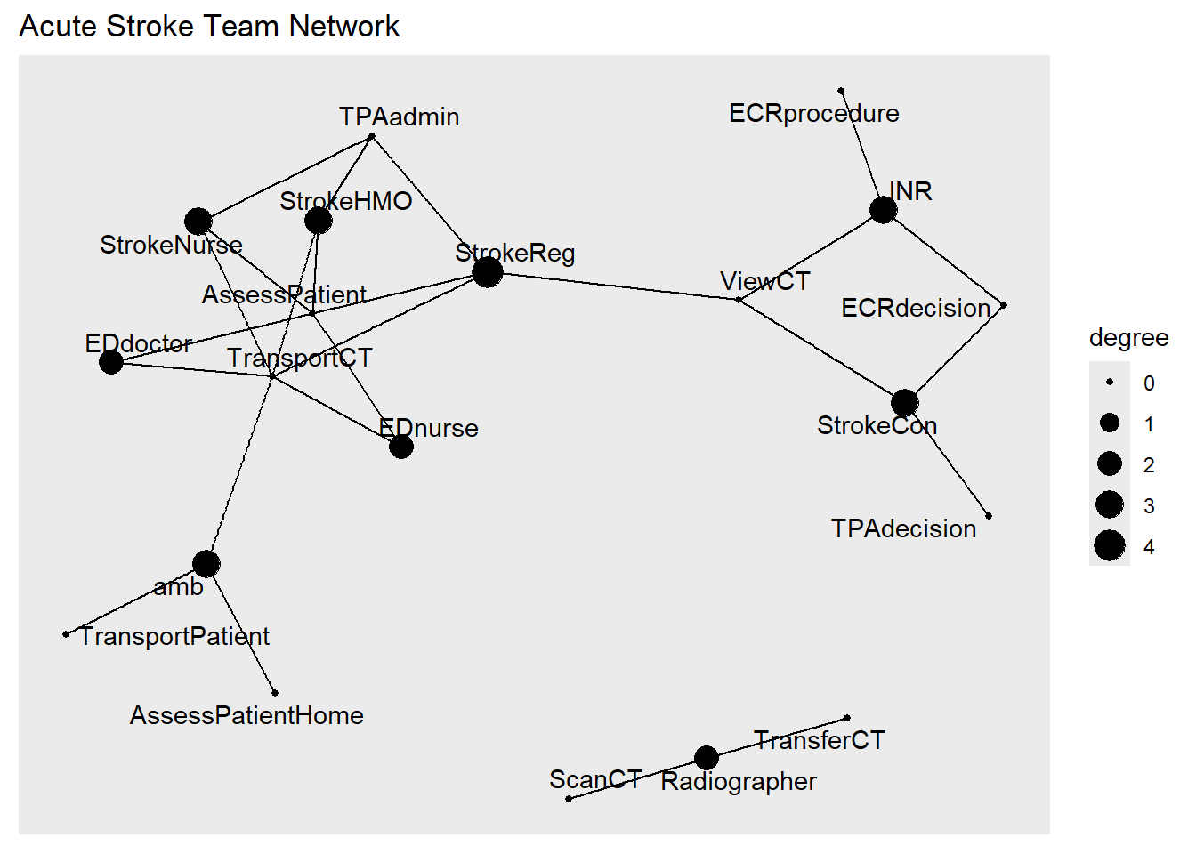
The igraph library does the heavy lifting in graph theory analysis. This aspect will be expanded on in the chapter on Graph Theory. However, the plotting function with igraph is still not optimal. The ggraph and tidygraph libraries extend the ggplot2 style to graph.
library(tidygraph)
Attaching package: 'tidygraph'
The following object is masked from 'package:reshape':

    rename
The following objects are masked from 'package:plyr':

    arrange, mutate, rename
The following object is masked from 'package:stats':

    filter
library(ggraph) #relationship among members of acute stroke teamtpa<-readr::read_csv("./Data-Use/TPA_edge010817.csv")%>%rename(from=V1, to=V2)
Rows: 25 Columns: 4
── Column specification ────────────────────────────────────────────────────────
Delimiter: ","
chr (2): V1, V2
dbl (2): time.line, time.capacity

ℹ Use `spec()` to retrieve the full column specification for this data.
ℹ Specify the column types or set `show_col_types = FALSE` to quiet this message.
#node by degree centralitygraph<-as_tbl_graph(tpa) %>%mutate(degree =centrality_degree())ggraph(graph, layout ='fr') +geom_edge_link() +#label size by degree centralitygeom_node_point(aes(size=degree))+#label nodegeom_node_text(aes(label=name),repel=T)+ggtitle("Acute Stroke Team Network")
Warning: Using the `size` aesthetic in this geom was deprecated in ggplot2 3.4.0.
ℹ Please use `linewidth` in the `default_aes` field and elsewhere instead.
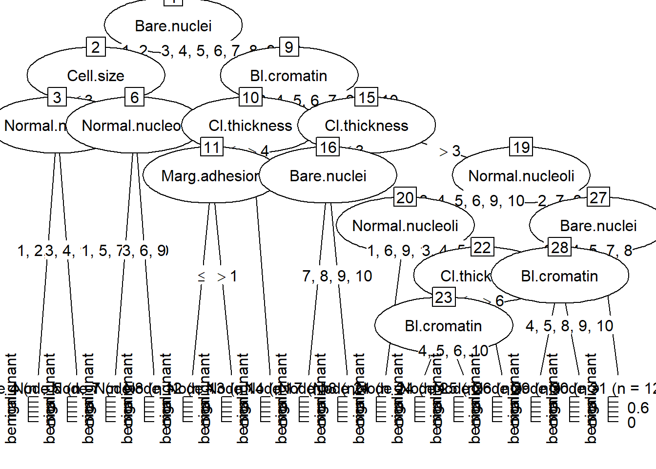
2.3.4 ggparty-decision tree
Decision tree can be plotted using ggplot2 and ggparty framework. This example uses data from the Breast Cancer dataset. It explores the effect of different histological features on class of breast tissue type.
library(ggparty)
Loading required package: partykit
Loading required package: grid
Loading required package: libcoin
Loading required package: mvtnorm
Attaching package: 'ggparty'
The following object is masked from 'package:ggraph':

    geom_node_label
library(partykit)library(tidyverse)data("BreastCancer",package ="mlbench")#check data typestr(BreastCancer)
BC<- BreastCancer %>%select(-Id)treeBC<-ctree(Class~., data=BC, control =ctree_control(testtype ="Teststatistic"))#plot tree using plot from base Rplot(treeBC)
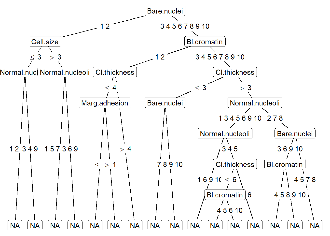
#plot tree using ggpartyggparty(treeBC) +geom_edge() +geom_edge_label() +geom_node_label(aes(label = splitvar),ids ="inner") +geom_node_label(aes(label = info),ids ="terminal")
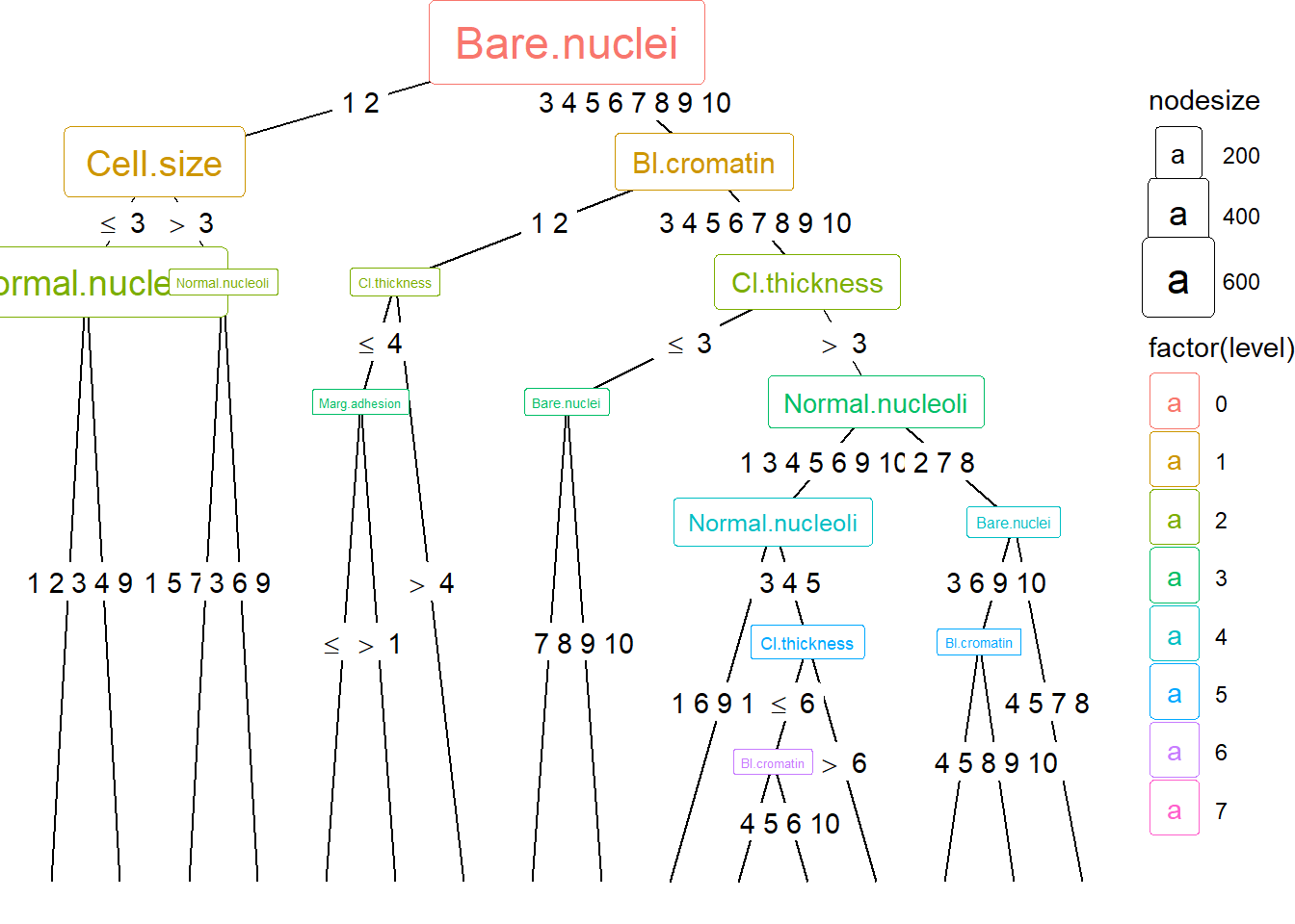
ggparty(treeBC) +geom_edge() +geom_edge_label() +# map color to level and size to nodesize for all nodesgeom_node_splitvar(aes(col =factor(level),size = nodesize)) +geom_node_info(aes(col =factor(level),size = nodesize))
2.3.5 Map
Several simple examples are provided here. They illustrate the different plotting methods used according to the type of data. It is important to check the structure of the data using class() function.
2.3.5.1 Thematic map
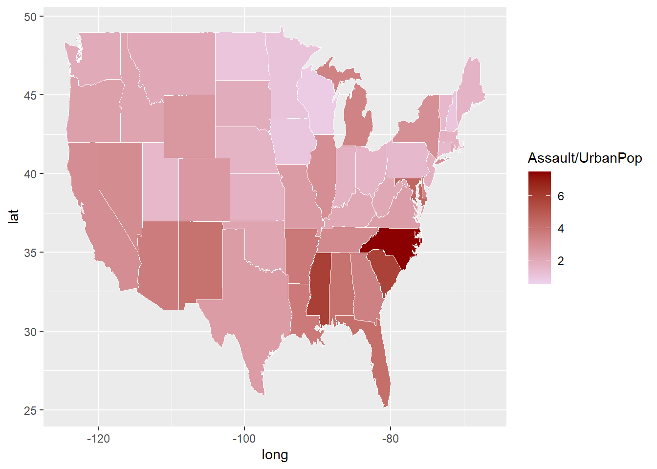
The ggplot2 library can also be used to generate thematic (choropleth) map. Here we use map_data function from ggplot2 to obtain a map of USA. Geocoded data are contained in the long and lat columns. The US map data is in standard dataframe format. In this case, the geom_map function is used for mapping. The USArrests data contains a column for murder, assault, rape and urban population. The assault data presented here is normalised by the population data. This section will be expanded further in the Geospatial Analysischapter.
Warning: `add_rownames()` was deprecated in dplyr 1.0.0.
ℹ Please use `tibble::rownames_to_column()` instead.
US <-map_data("state") map_assault<-ggplot()+geom_map(data=US, map=US,aes(x=long, y=lat, map_id=region),fill="#ffffff", color="#ffffff", size=0.15)+#add USArrests data heregeom_map(data=arrest, map=US,aes(fill=Assault/UrbanPop, map_id=region),color="#ffffff", size=0.15)+scale_fill_continuous(low='thistle2', high='darkred', guide='colorbar')
Warning: Using `size` aesthetic for lines was deprecated in ggplot2 3.4.0.
ℹ Please use `linewidth` instead.
Warning in geom_map(data = US, map = US, aes(x = long, y = lat, map_id =
region), : Ignoring unknown aesthetics: x and y
map_assault
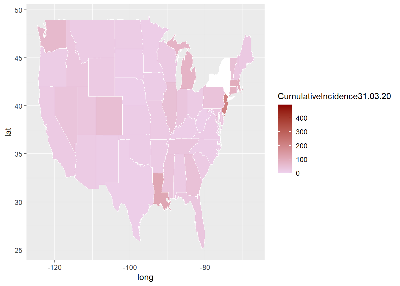
This is a more complex example and uses state by state COVID-19 data CDC website. Steps to extract the COVID-10 is shown in the next chapter. The shapefile for USA can also be extracted from tigris library. A challenge with plotting a map of US is that the country extends far North to Alaska and East to pacific islands.
Warning in geom_map(data = US, map = US, aes(x = long, y = lat, map_id =
region), : Ignoring unknown aesthetics: x and y
map_covid
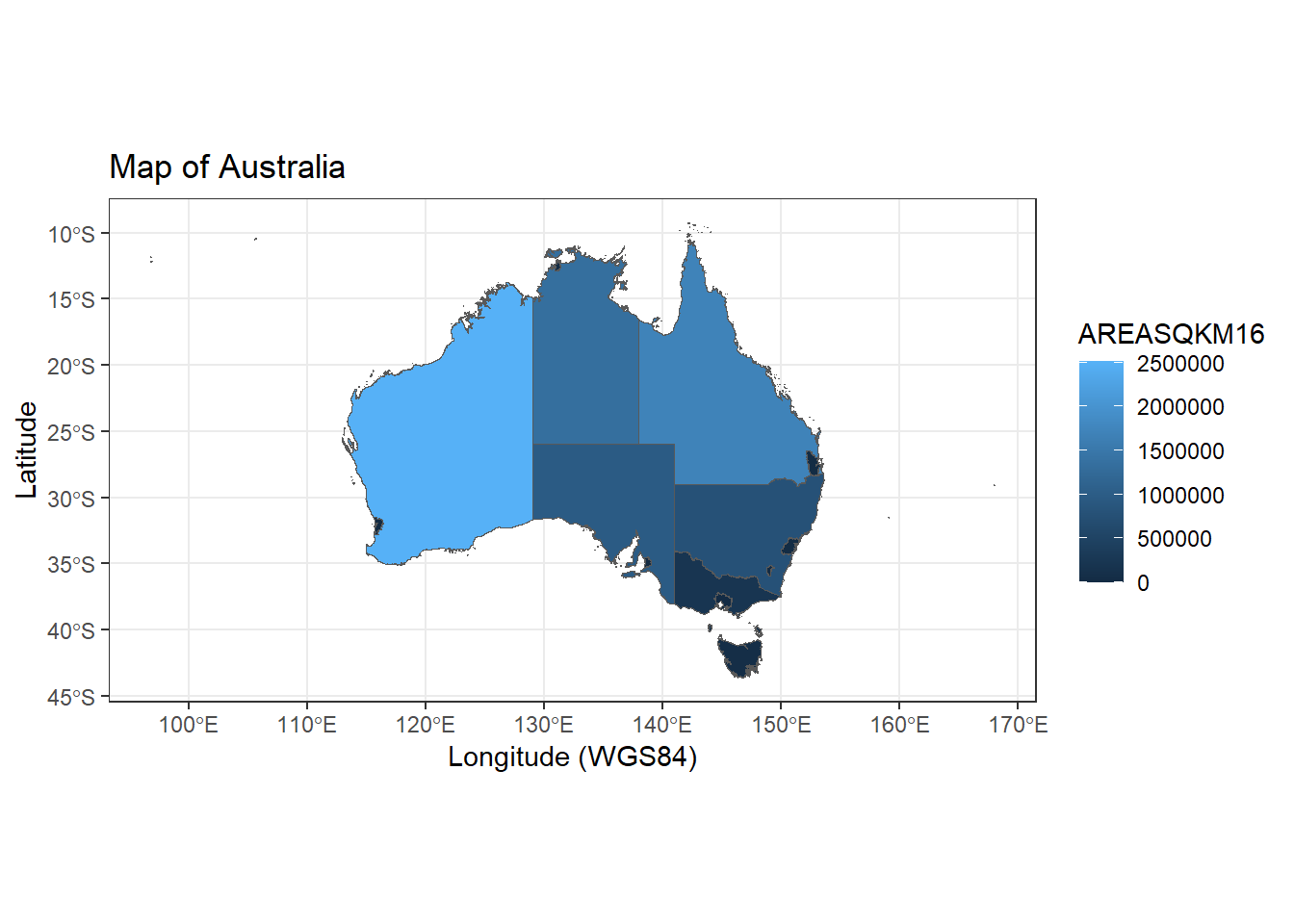
In the simple example below we will generate a map of Australian State territories color by size of area. The ggplot2 combines with sf library and uses the shape file data in the geom_sf call.
ggplot() +geom_sf(data=Aust,aes(fill=AREASQKM16))+labs(x="Longitude (WGS84)", y="Latitude", title="Map of Australia") +theme_bw()
2.3.5.2 tmap
The tmap library works in conjunction with ggplot2 and sf. The tm_shape function takes in the shape data. The tm_polygon function color the shape file with the column data of interest.
library(tmap)
The legacy packages maptools, rgdal, and rgeos, underpinning the sp package,
which was just loaded, will retire in October 2023.
Please refer to R-spatial evolution reports for details, especially
https://r-spatial.org/r/2023/05/15/evolution4.html.
It may be desirable to make the sf package available;
package maintainers should consider adding sf to Suggests:.
The sp package is now running under evolution status 2
(status 2 uses the sf package in place of rgdal)
load("./Data-Use/world_stroke.Rda")#data from GBD 2016 investigatorscolnames(world_sfdf)
old-style crs object detected; please recreate object with a recent sf::st_crs()
old-style crs object detected; please recreate object with a recent sf::st_crs()
old-style crs object detected; please recreate object with a recent sf::st_crs()
old-style crs object detected; please recreate object with a recent sf::st_crs()
old-style crs object detected; please recreate object with a recent sf::st_crs()
2.3.5.3 Voronoi
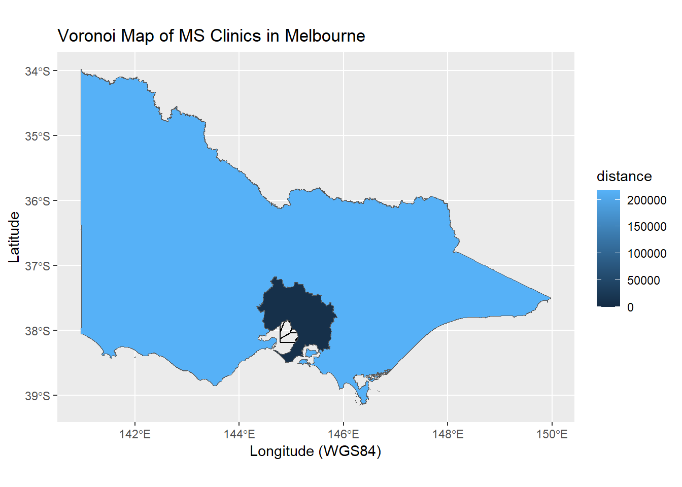
The ggplot2 and sf libraries are extended to include drawing of voronoi. Voronoi is a special type of polygon. It can be seen as a mathematical approach to partition regions such that all points within the polygons are closest (depending on distance metrics) to the seed points. Voronoi has been used in disease mapping (John Snow mapping of Broad Street Cholera outbreak) and meteorology (Alfred Thiessen polygon method for measuring rainfall in basin). This is a more complex coding task. It uses the geom_voronoi call from ggvoronoi library. Some libraries have vignettes to help you implement the codes. The vignette in the ggvoronoi library can be called using vignette(“ggvoronoi”). The osmdata library will be used to provide map from OpenStreetMap. A related library is OpenStreetMap. The latter library uses raster file whereas osmdata provides vectorised map data. In the chapter on Geospatial Analysis we will exapnd on the use of OpenStreetMap. One issue with the use of voronoi is that there are infinite sets and so a boundary needs to set. In the example below, the boundary was set for Greater Melbourne.
library(dplyr)library(ggvoronoi)
rgeos version: 0.6-3, (SVN revision 696)
GEOS runtime version: 3.11.2-CAPI-1.17.2
Please note that rgeos will be retired during October 2023,
plan transition to sf or terra functions using GEOS at your earliest convenience.
See https://r-spatial.org/r/2023/05/15/evolution4.html for details.
GEOS using OverlayNG
Linking to sp version: 2.0-0
Polygon checking: TRUE
library(ggplot2)library(sf)#subset data with dplyr for metropolitan melbournemsclinic<-read.csv("./Data-Use/msclinic.csv") %>%filter(clinic==1, metropolitan==1)Victoria<-st_read("./Data-Use/GCCSA_2016_AUST.shp") %>%filter(STE_NAME16=="Victoria")
Reading layer `GCCSA_2016_AUST' from data source
  `C:\Users\phant\Documents\Book\Healthcare-R-Book\Data-Use\GCCSA_2016_AUST.shp'
  using driver `ESRI Shapefile'
Simple feature collection with 34 features and 5 fields (with 18 geometries empty)
Geometry type: MULTIPOLYGON
Dimension:     XY
Bounding box:  xmin: 96.81694 ymin: -43.74051 xmax: 167.998 ymax: -9.142176
Geodetic CRS:  GDA94
m<-ggplot(msclinic)+geom_point(aes(x=lon,y=lat))+#add hospital locationgeom_voronoi(aes(x=lon,y=lat,fill=distance),fill=NA, color="black")+#create voronoi from hospital locationgeom_sf(data=Victoria,aes(fill=AREASQKM16)) +labs(x="Longitude (WGS84)", y="Latitude", title="Voronoi Map of MS Clinics in Melbourne")m
Warning: `fortify(<SpatialPolygonsDataFrame>)` was deprecated in ggplot2 3.4.4.
ℹ Please migrate to sf.
This map is not so useful as the features of Victoria overwhelm the features of Greater Melbourne.
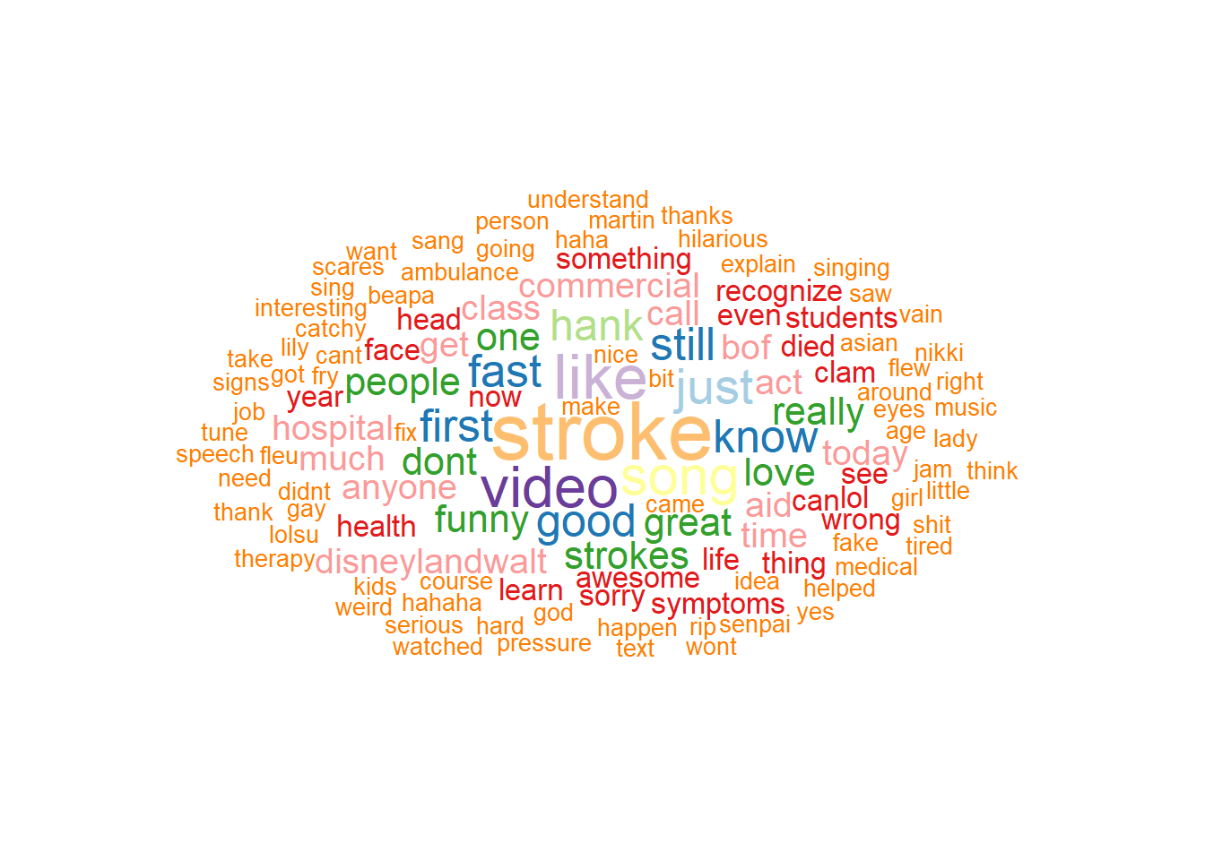
2.3.6 ggwordcloud
The ggwordcloud library extend the ggplot2 family to creating wordcloud. The following is an illustration of wordcloud created from comments on Youtube video “Stroke Heroes Act Fast”.
library(ggwordcloud)library(tm)
Loading required package: NLP
Attaching package: 'NLP'
The following object is masked from 'package:ggplot2':

    annotate
library(tidyverse)heroes_df<-read.csv("./Data-Use/Feb_01_1_49_59 PM_2018_AEDT_YoutubeData.csv",stringsAsFactors =FALSE)#cleaning datakeywords <- heroes_df$Comment keywords <-iconv(keywords, to ='utf-8')#create corpusmyCorpus <-VCorpus(VectorSource(keywords))#lower casemyCorpus <-tm_map(myCorpus, content_transformer(tolower))#remove numermyCorpus <-tm_map(myCorpus, removeNumbers)#remove punctuationmyCorpus <-tm_map(myCorpus, removePunctuation)#remove stopwordsmyCorpus <-tm_map(myCorpus, removeWords, stopwords("english"),lazy=TRUE) #remove white spacemyCorpus <-tm_map(myCorpus, stripWhitespace, lazy=TRUE)#term document matrixdtm <-DocumentTermMatrix(myCorpus,control =list(wordLengths=c(3, 20)))#remove sparse termsdtm<-removeSparseTerms(dtm, 0.95)#remove words of length <=3tdm=TermDocumentMatrix(myCorpus,control =list(minWordLength=4,maxWordLength=20) )m <-as.matrix(tdm)v <-sort(rowSums(m),decreasing=TRUE)#remove words with frequency <=1d <-data.frame(word =names(v),freq=v) %>%filter(freq>1)#wordcloudggplot(data = d, aes(label = word, size = freq, col =as.character(freq))) +geom_text_wordcloud(rm_outside =TRUE, max_steps =1,grid_size =1, eccentricity = .8)+scale_size_area(max_size =12)+scale_color_brewer(palette ="Paired", direction =-1)+theme_void()
2.3.7 gganimate
The library gganimate can be used to generate videos in the form of gif file. The data needs to be collated from wide to long format. For the purpose of this book, the code has been turned off.
library(ggplot2)library(gganimate)#ensure data in long format, Y =NIHSSu <-ggplot(dtTime2, aes(period, meanY , color = T, frame = period)) +geom_bar(stat="identity") +geom_text(aes(x =11.9, label = period), hjust =0) +xlim(0,13)+coord_cartesian(clip ='off') +facet_wrap(~meanY)+labs(title ='ECR Trials', y ='Number') +transition_reveal(period)u#create gif#animate(u,fps=15,duration=15)#anim_save(u,file="./Data-Use/simulated_ECR_trial.gif", width=800, height=800)
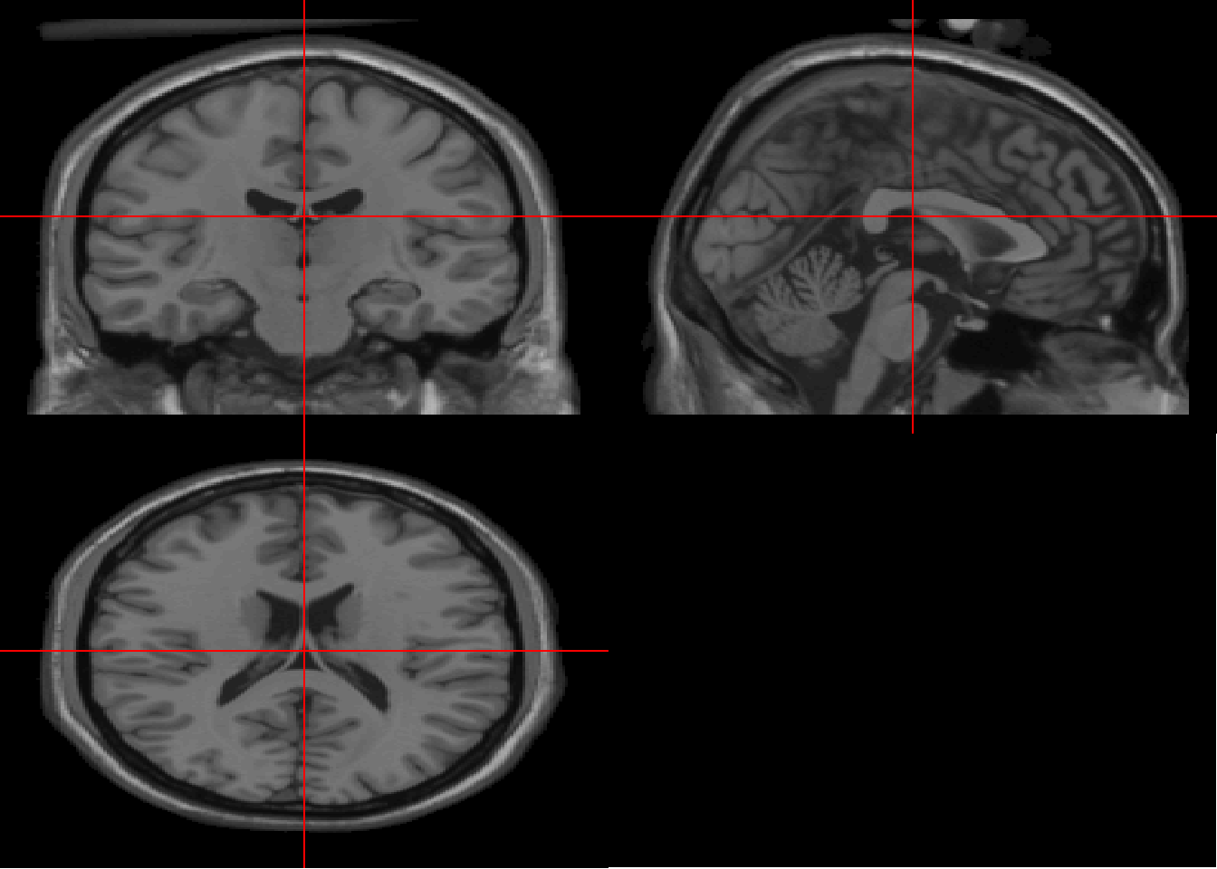
2.3.8 ggneuro
There are several ways of plotting mri scans. The ggneuro library is illustrated here as it relates to the ggplot2 family. The Colin \(T_1\) scan is a high resolution scan.
Plotly is a javascript library which has its own API . It has additional ability for interaction as well as create a video. Examples are provided with calling plotly directly or via ggplot2. In the examples below, the plots are performed using ggplot2 and then pass onto plotly using ggplotly function. This example uses the Leukemia dataset from Stat2Data library. The plotly syntax uses ~ after the = symbol to identify a variable for plotting.
2.4.1 Histogram with plotly
library (plotly)
Attaching package: 'plotly'
The following object is masked from 'package:neurobase':

    colorbar
The following object is masked from 'package:oro.nifti':

    slice
The following object is masked from 'package:reshape':

    rename
The following objects are masked from 'package:plyr':

    arrange, mutate, rename, summarise
The following object is masked from 'package:ggplot2':

    last_plot
The following object is masked from 'package:stats':

    filter
The following object is masked from 'package:graphics':

    layout
data("Leukemia") #treatment of leukemiaplot_ly (data=Leukemia, x=~Age, color =~as.factor(Status))
No trace type specified:
  Based on info supplied, a 'histogram' trace seems appropriate.
  Read more about this trace type -> https://plotly.com/r/reference/#histogram
Warning in RColorBrewer::brewer.pal(N, "Set2"): minimal value for n is 3, returning requested palette with 3 different levels

Warning in RColorBrewer::brewer.pal(N, "Set2"): minimal value for n is 3, returning requested palette with 3 different levels
2.4.2 Scatter plot with plotly
library(plotly)library(Stat2Data)data("Leukemia") #treatment of leukemia#scatter plot directly from plotlyplot_ly(x=~Age,y=~Smear, #percentage of blastcolor=~as.factor(Status), #dead or alivesymbol=~Resp, symbols=c('circle' ,'square'), #Response to treatmentdata=Leukemia)
No trace type specified:
  Based on info supplied, a 'scatter' trace seems appropriate.
  Read more about this trace type -> https://plotly.com/r/reference/#scatter
No scatter mode specifed:
  Setting the mode to markers
  Read more about this attribute -> https://plotly.com/r/reference/#scatter-mode
Warning in RColorBrewer::brewer.pal(N, "Set2"): minimal value for n is 3, returning requested palette with 3 different levels

Warning in RColorBrewer::brewer.pal(N, "Set2"): minimal value for n is 3, returning requested palette with 3 different levels
2.4.3 Bar plot with plotly
Plotly can uses a ggplot object directly.
#using the epilepsy data in p generated above for bar plotggplotly(p)
Bar plot in plotly is specified by the argument type.
Warning: Coercing CRS to epsg:3067 (ETRS89 / TM35FIN)
Data is licensed under: Attribution 4.0 International (CC BY 4.0)
#sf object)#join shapefile and population datamunicipalities2<-right_join(municipalities, FinPop2, by=c("name"="...1")) %>%rename(Pensioner=`Proportion of pensioners of the population, %, 2019`,Age65=`Share of persons aged over 64 of the population, %, 2020`) %>%na.omit()plot_ly(municipalities2, split =~Age65)
No trace type specified:
  Based on info supplied, a 'scatter' trace seems appropriate.
  Read more about this trace type -> https://plotly.com/r/reference/#scatter
The plot_geo function enable usage of high level geometries.
plot_geo(municipalities2, split =~Age65)
Warning: The trace types 'scattermapbox' and 'scattergeo' require a projected
coordinate system that is based on the WGS84 datum (EPSG:4326), but the crs
provided is: '+proj=utm +zone=35 +ellps=GRS80 +towgs84=0,0,0,0,0,0,0 +units=m
+no_defs'. Attempting transformation to the target coordinate system.
No trace type specified:
  Based on info supplied, a 'scatter' trace seems appropriate.
  Read more about this trace type -> https://plotly.com/r/reference/#scatter
This flow diagram can also be plotted using mermaid.js. This diagram was used to illustrate the time to administer antiplatelet therapy (Phan TG 2021).
Berkhemer, O. A., P. S. Fransen, D. Beumer, L. A. van den Berg, H. F. Lingsma, A. J. Yoo, W. J. Schonewille, et al. 2015. “A randomized trial of intraarterial treatment for acute ischemic stroke.”N. Engl. J. Med. 372 (1): 11–20.
Campbell, B. C., P. J. Mitchell, T. J. Kleinig, H. M. Dewey, L. Churilov, N. Yassi, B. Yan, et al. 2015. “Endovascular therapy for ischemic stroke with perfusion-imaging selection.”N. Engl. J. Med. 372 (11): 1009–18.
Phan TG, Singhal S, Clissold B. 2021. “Network Mapping of Time to Antithrombotic Therapy Among Patients with Ischemic Stroke and Transient Ischemic Attack (TIA).”Front Neurol 12: 651869. https://doi.org/10.3389/fneur.2021.651869.
Seneviratne, U., Z. M. Low, Z. X. Low, A. Hehir, S. Paramaswaran, M. Foong, H. Ma, and T. G. Phan. 2019. “Medical health care utilization cost of patients presenting with psychogenic nonepileptic seizures.”Epilepsia 60 (2): 349–57.
Wickham, Hadley. 2016. Ggplot2: Elegant Graphics for Data Analysis. Springer-Verlag New York. https://ggplot2.tidyverse.org.